

2025
Redesigning the Kan Homepage – From a News Hub to a Personalized Content Experience
Kan - Israeli Public Broadcasting Corporation
UX Designer
b2c
My Role
UX Designer
Timeline
2 Month
Team
2 Products Designers
1 Product Manager
1 UX Lead
Live Website


AI Summary
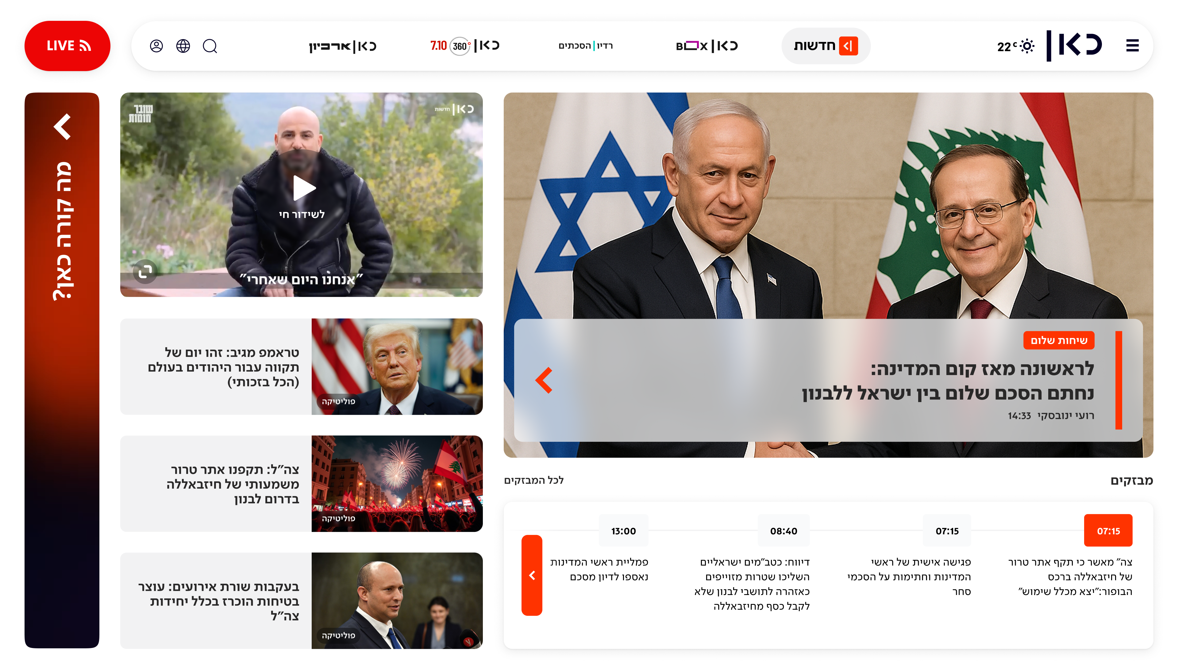
This case study outlines the research-driven redesign strategy for the Kan Israeli Public Broadcasting Corporation's website homepage. The core challenge was surfacing a vast content catalog to a varied audience, but data revealed most users never scrolled past the "fold," missing most of the content.
Research identified five distinct user personas and key time-based usage patterns. This led to the chosen solution: "What's up Kan?", a dynamic, modular, and personalized hub that adapts to each user's behavior and the time of day, ensuring all relevant content is surfaced effectively within the first fold.
The Challenge: Content Overload vs. User Attention
The high-level challenge was to balance three competing strategic goals:
- Accessibility: Make all of Kan's disparate content worlds (News, Series, Radio, Podcasts) easily accessible from a single entry point.
- Engagement: Create a seamless, cross-platform experience (web, app) that increases time-on-site and encourages continuous user engagement.
- Brand Identity: Reinforce Kan's brand as a high-quality, trustworthy, and multi-disciplinary public broadcaster through its visual language and content prioritization.
How Might We..
Based on these challenges, we framed our thinking around a few key questions:

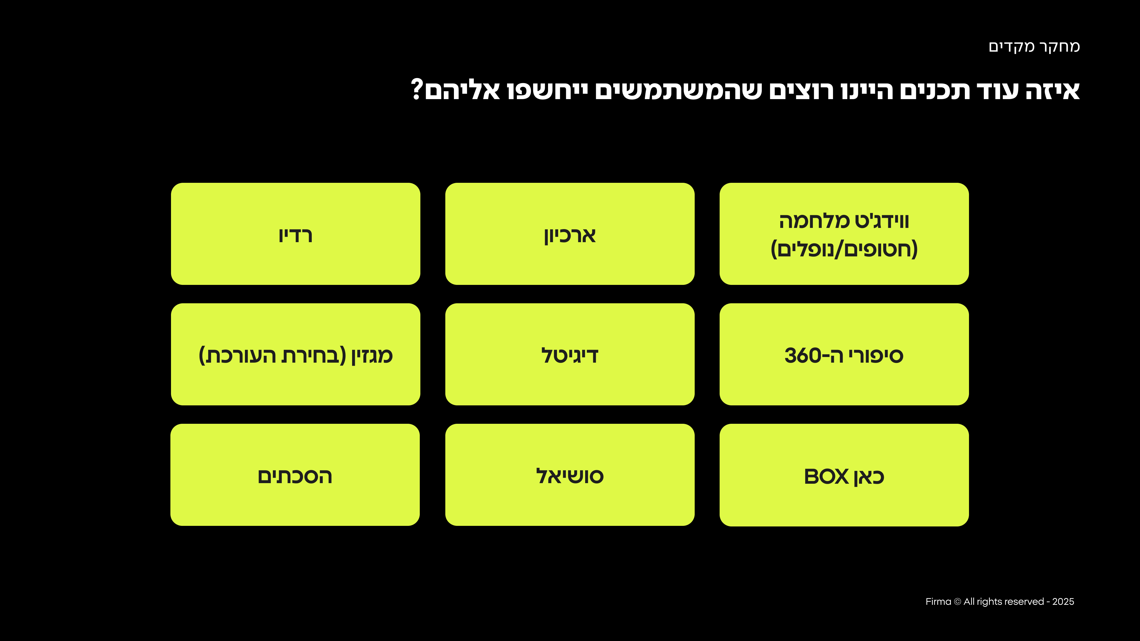
How might we present the full breadth of Kan's content worlds (News, VOD, Radio) in the limited space of the first fold?

How might we surface the right content to the right user at the right time?
How might we create a more engaging and continuous experience that encourages users to explore beyond the first click?
Our goal was to create an homepage that serves as the main gateway to Kan's diverse content worlds. Its purpose is to present an updated, accessible snapshot of all key content—including news, VOD (Kan BOX), radio, podcasts, and magazine articles—and allow users to easily connect with what interests them.
Understanding deeper the problems & limitations
Problem #1:
Users Don't Scroll Past the Fold
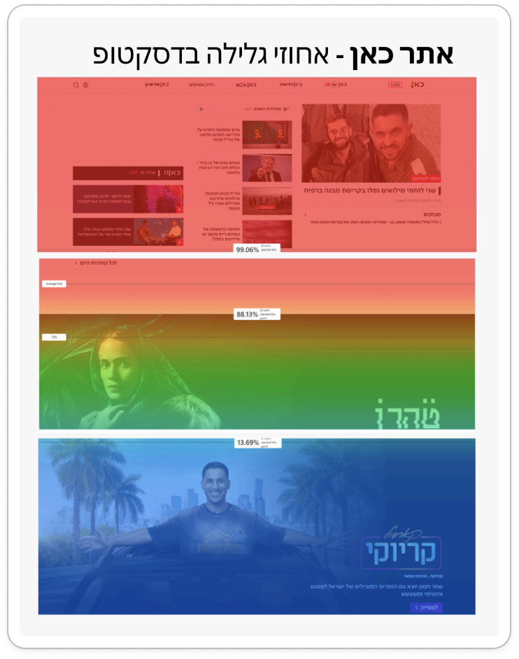
This behavior meant that most of Kan's content, which was meticulously categorized and placed further down the page, was simply never seen. The existing design failed to expose users to the full breadth of the platform's offerings, leading to missed engagement opportunities and a failure to meet key business objectives.
Problem #2:
Conflicting Stakeholder Requirements for the First Fold
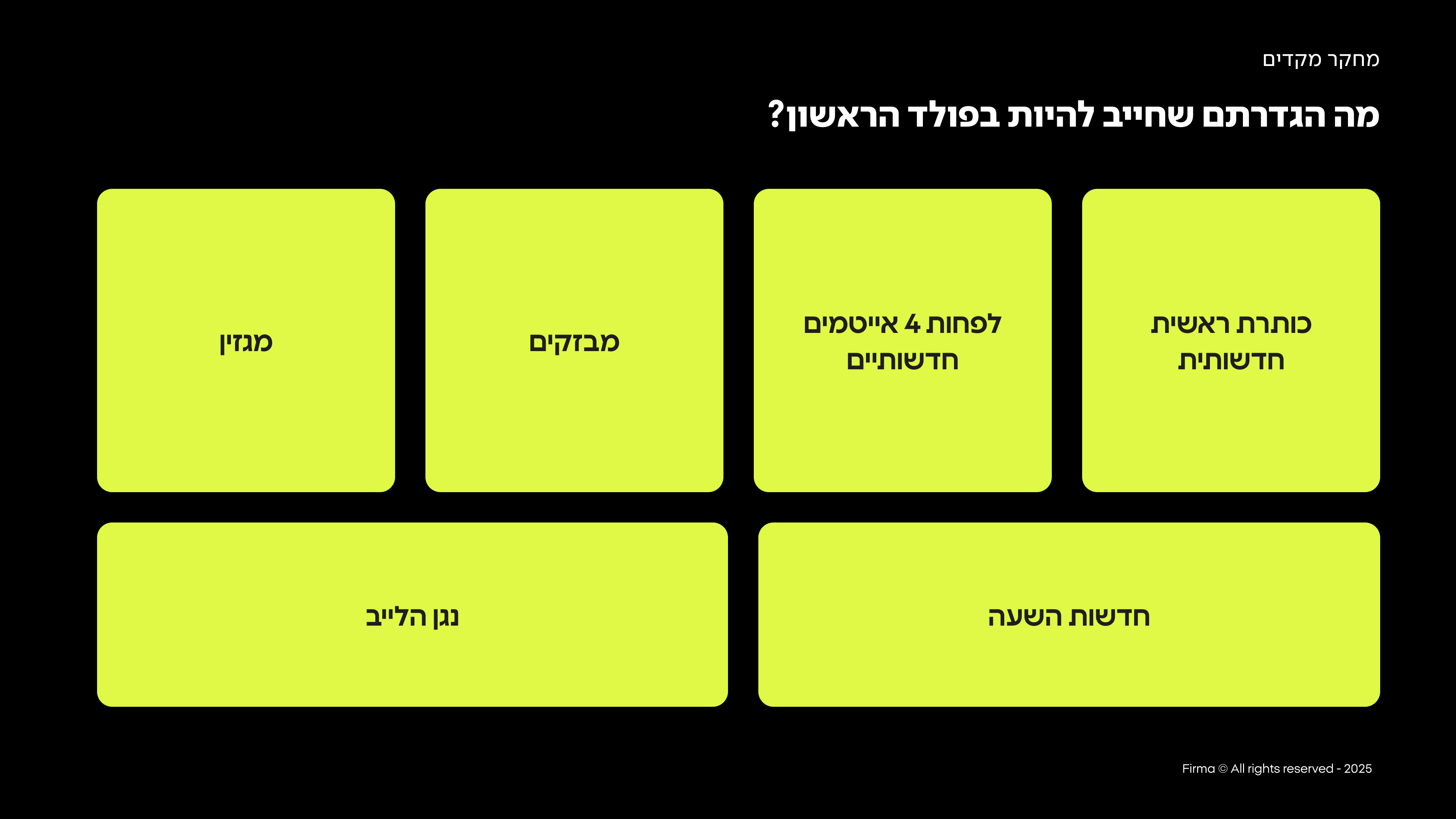
homepage was burdened with a large and conflicting list of stakeholder demands for "above the fold" content. As illustrated below, the first fold was required to simultaneously show the live player, the main news headline, at least four other news items, news flashes, and magazine content. This was in addition to a long list of other content worlds (VOD, radio, podcasts, archives) that also needed exposure.
Understanding the Users Through Data Analysis
A preliminary research phase, combining quantitative data and user behavior analysis, yielded three main insights that shaped our design:
Insight #1
Users consume different content at different hours of the day
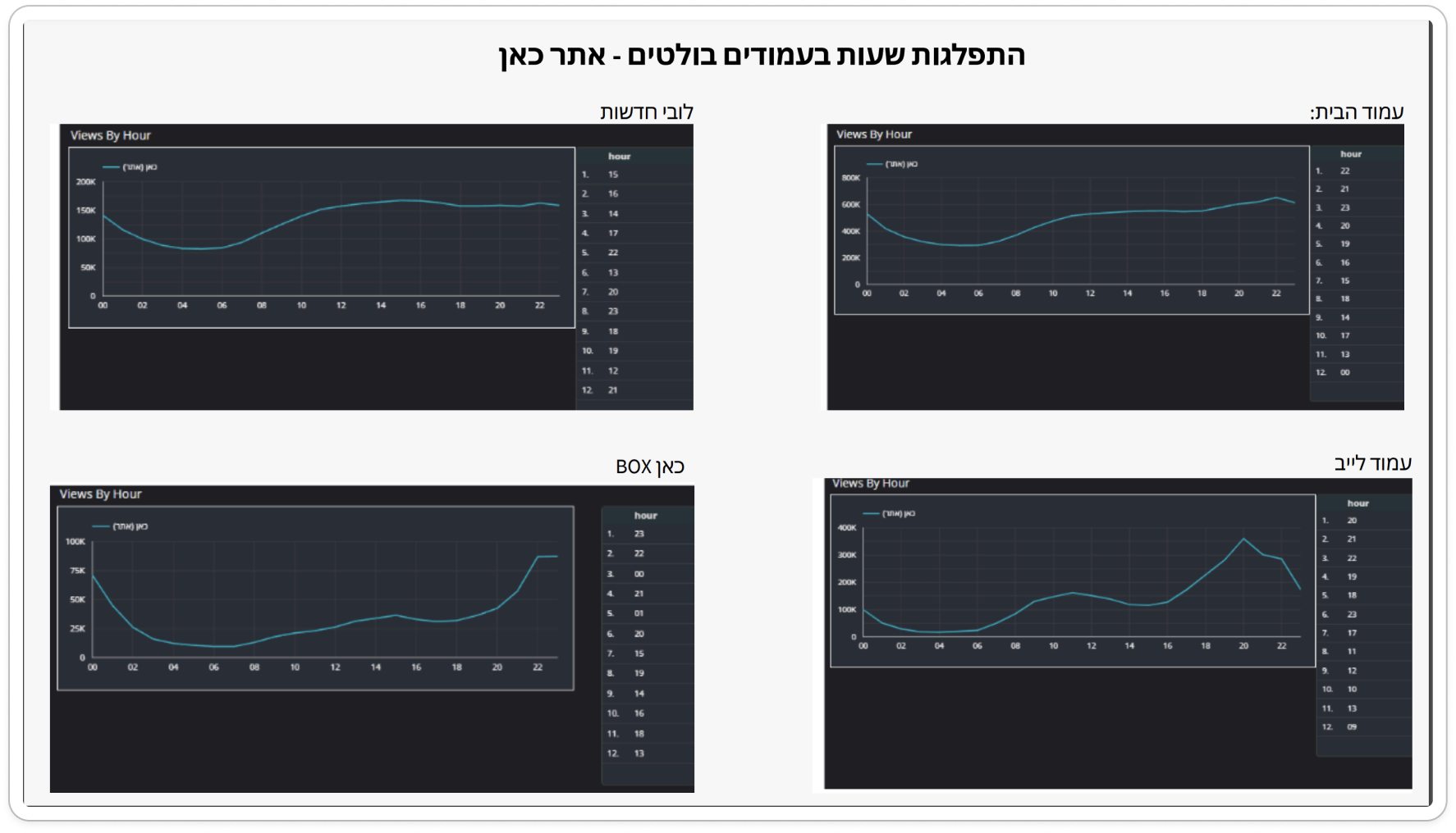
In the morning, they consume news, radio, and podcasts. At night, they consume Kan Box (TV series and movies).
Insight #2
Navigation is purposeful
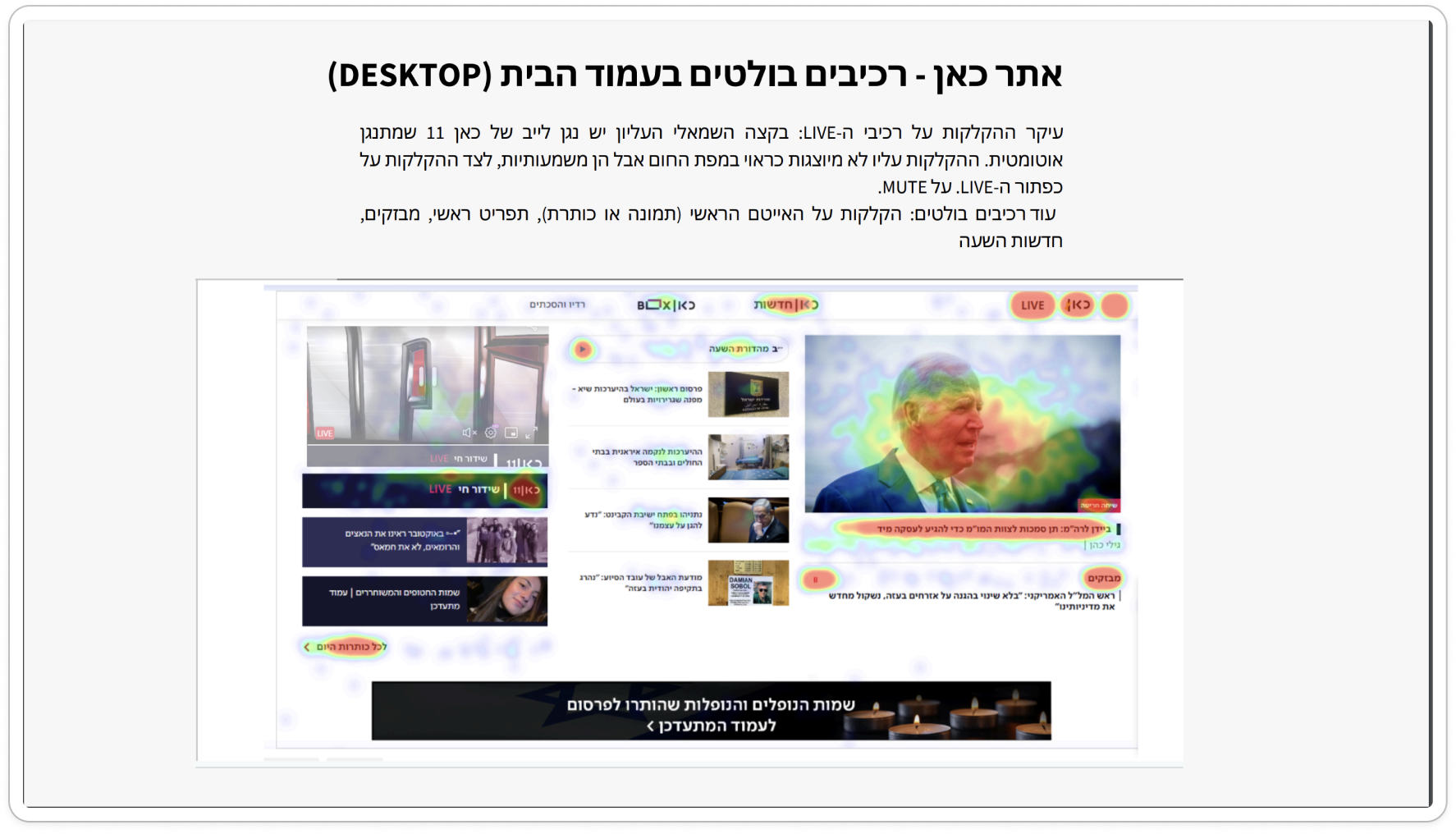
Heatmaps showed that users are not idly browsing. They arrive with a goal and know how to navigate, with most clicks concentrated on the LIVE player, the main news headline, and the main navigation menu.
The Solution: "What's up Kan?"
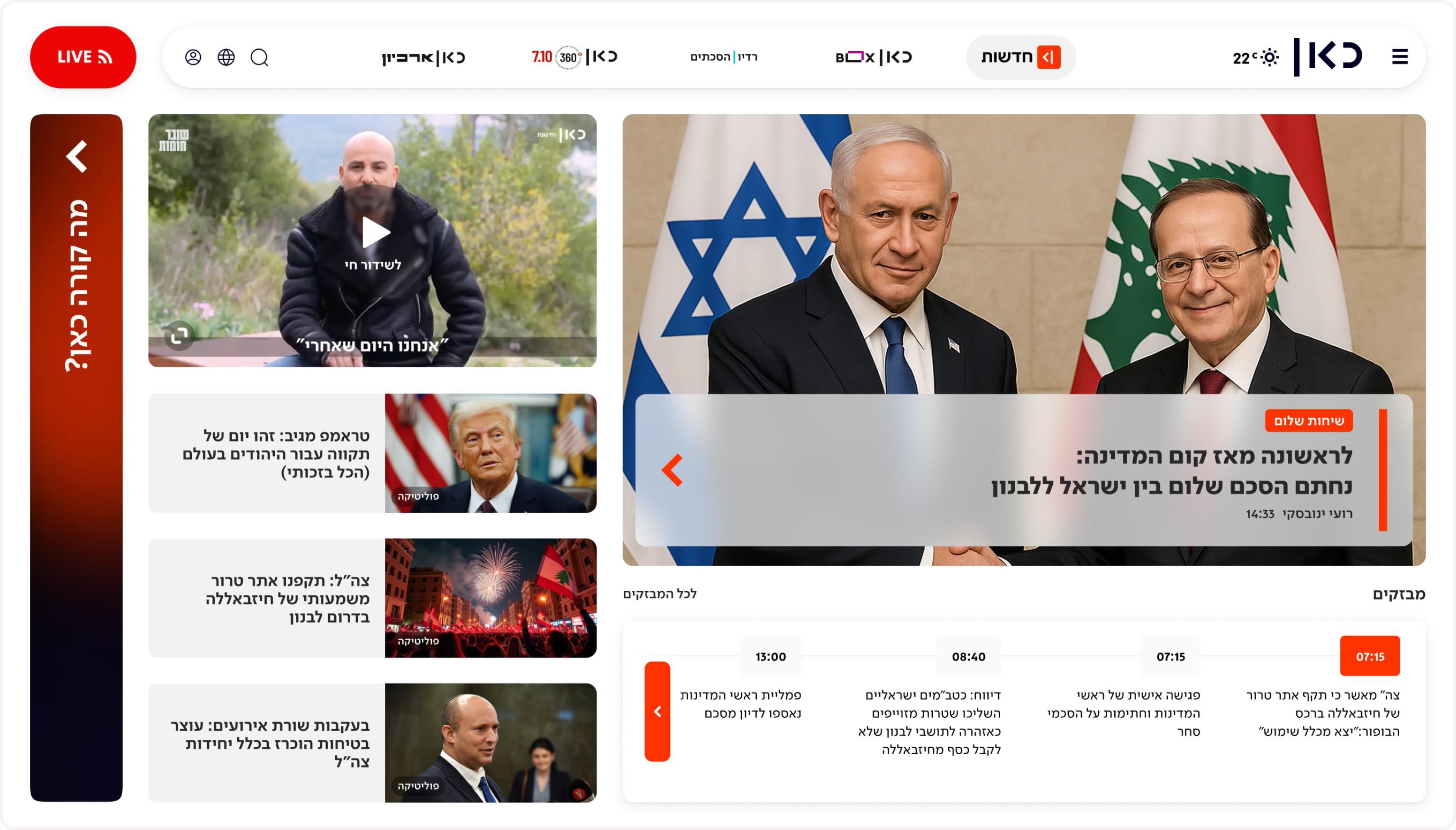
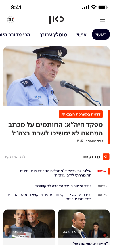
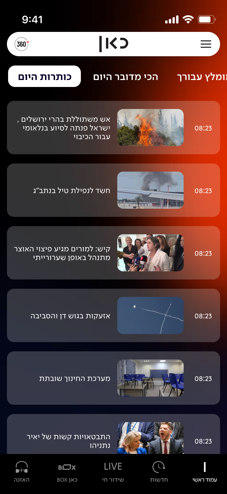
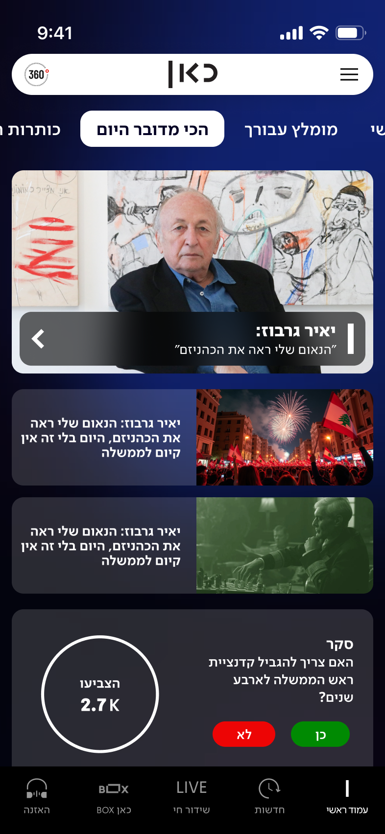
Our research insights led to one clear solution: a dynamic, modular, and personalized hub designed to solve the "no scroll" problem by bringing all relevant content to the user.
We named this concept "What's up Kan?" because it's designed to answer that very question for each user, presenting exactly what's relevant to them, right now.
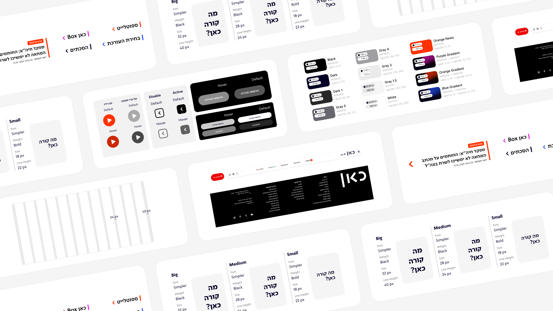
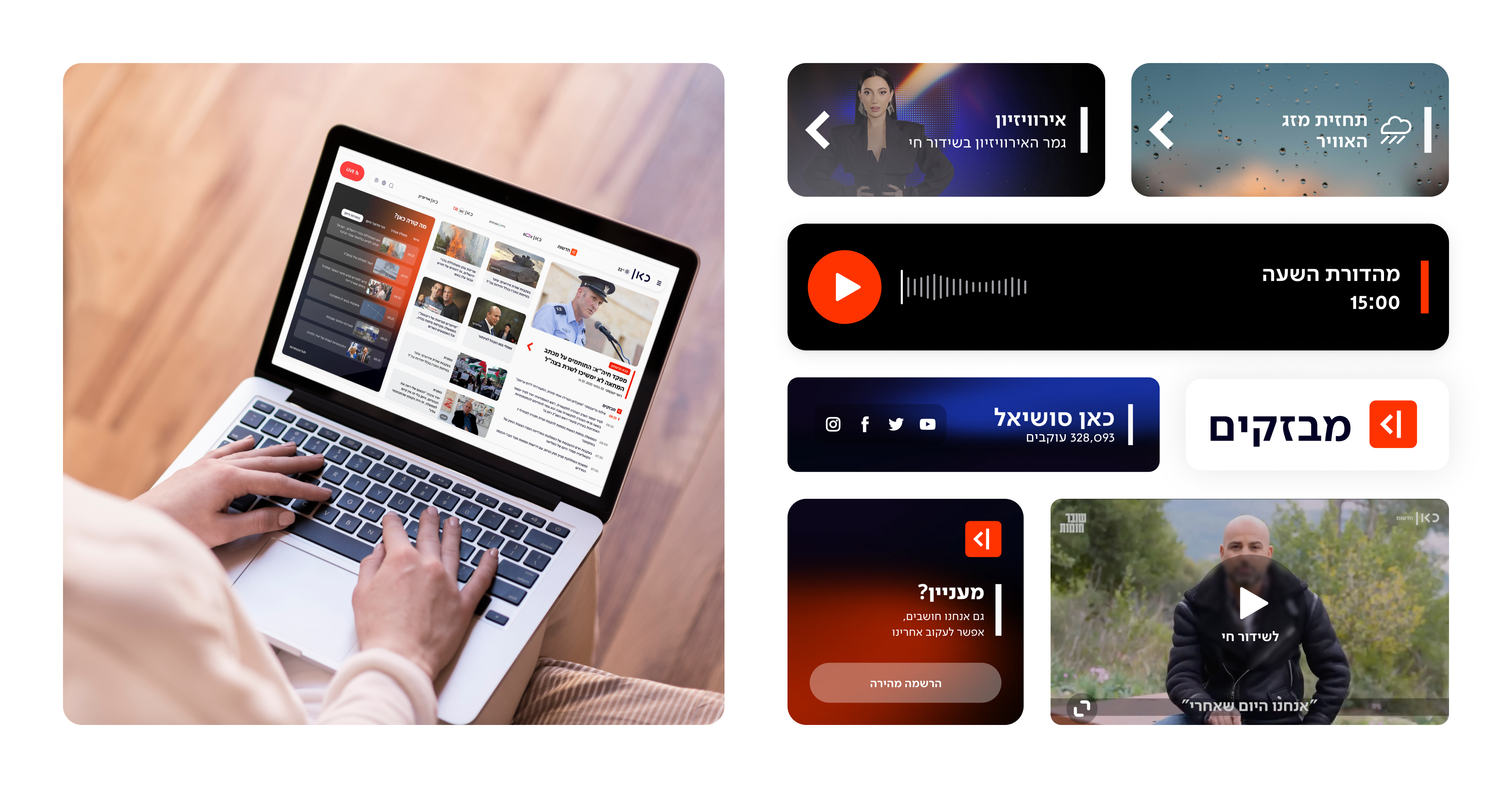
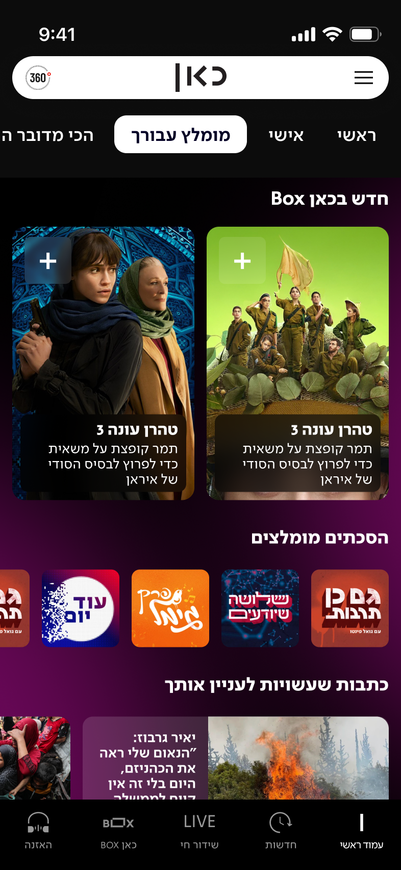
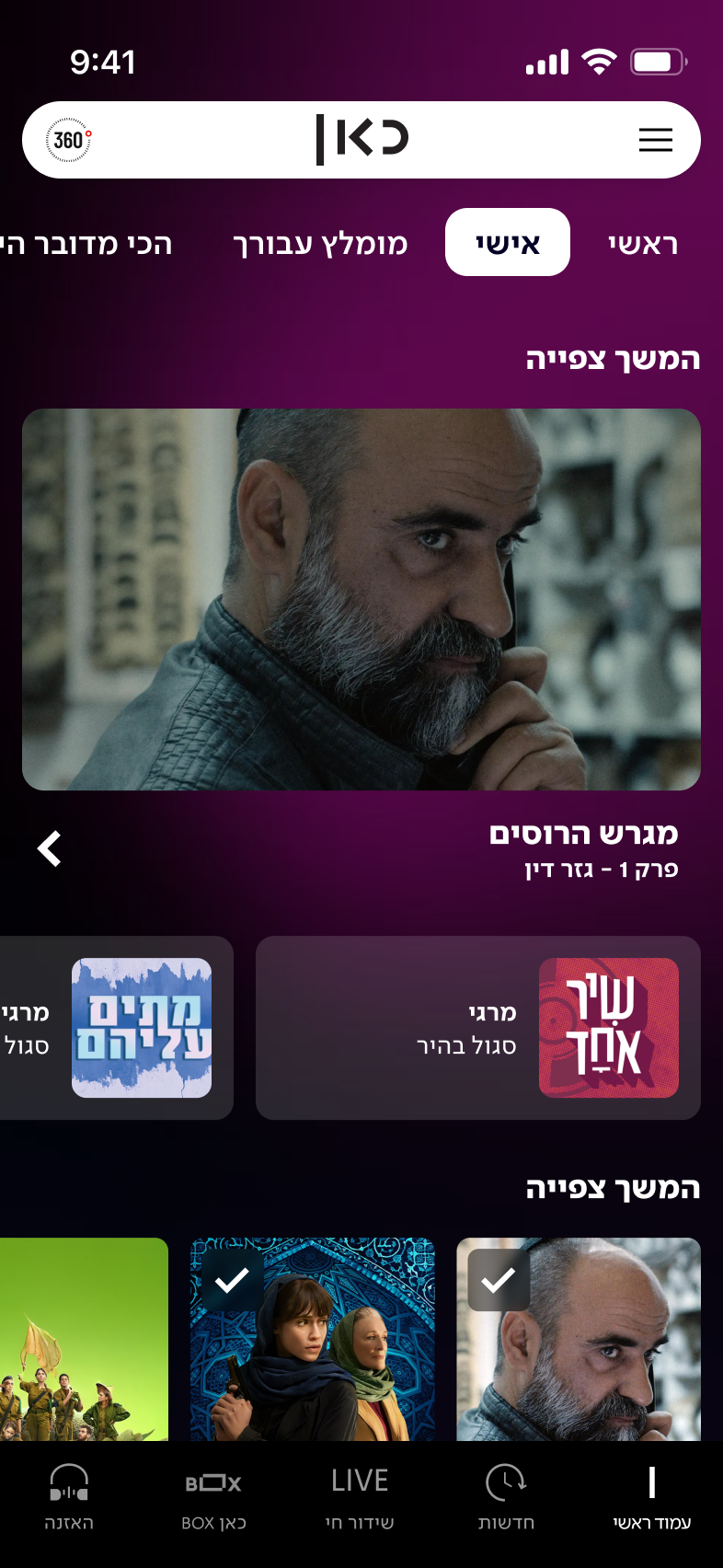
Key Features: A flexible grid system that surfaces all key content verticals (News, News Flashes, VOD, Radio, Podcasts, Magazine) within the first fold. The layout and prominence of these modules dynamically change based on the time of day, aligning with user consumption patterns (e.g., surfacing Radio in the morning and VOD in the evening).
Personalization: For logged-in users, the hub becomes truly personal. It features "Continue Watching" and "Continue Listening" modules, creating a seamless, continuous experience that works across all Kan platforms (web, app, TV) and builds long-term user loyalty. This approach directly serves all five user personas and elegantly resolves the stakeholder conflict by creating a system where all content can be seen.
More Projects
UX at Scale
Design System
Designing for Scale
at Bank Leumi
How I drove UX consistency and managed product complexity for a 1M+ user banking app.
E-Commerce
b2c
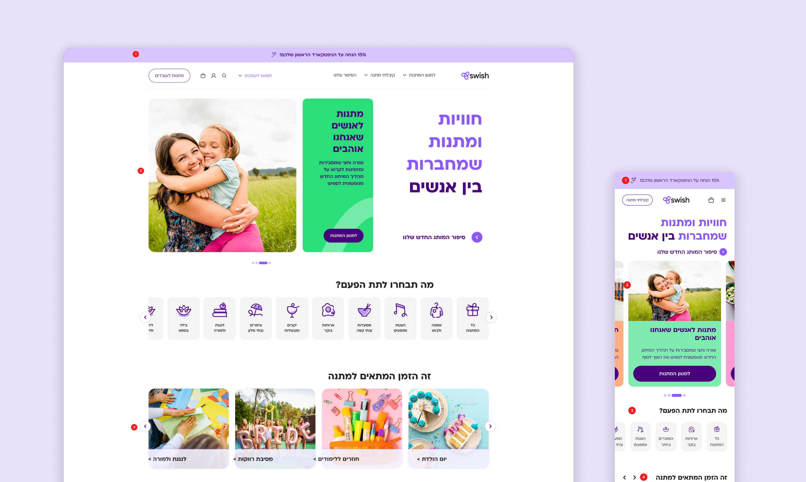
Re-designing Swish E-commerce Experience
How I drove UX consistency and managed product complexity for a 1M+ user banking app.
AI
Product Lead
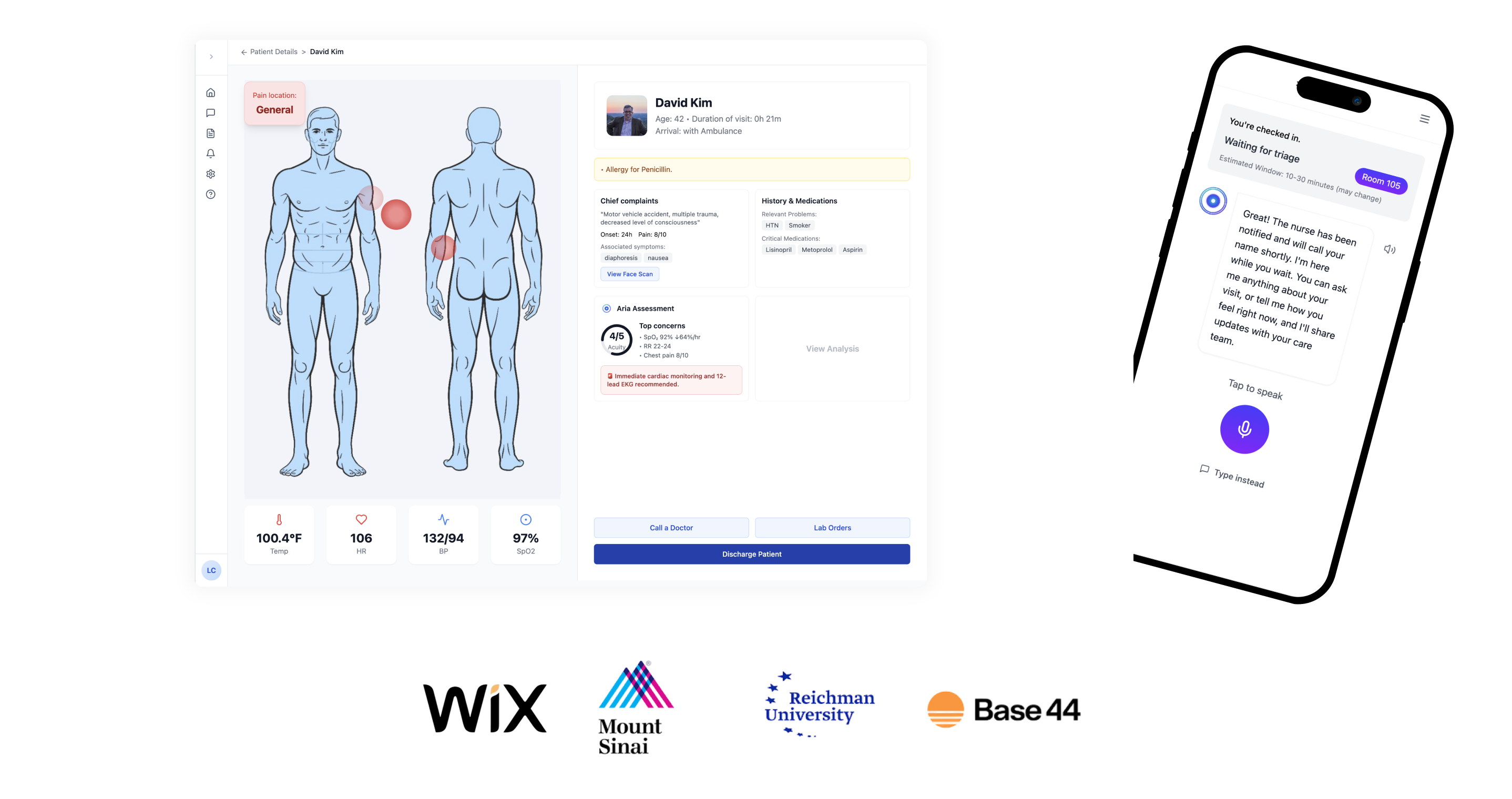
Aria.AI: Empowering ER Nurses with Smart Triage
Award-winning AI agent reduces cognitive overload and helps emergency room nurses prioritize patients with confidence and speed.
Home
About
2025
Redesigning the Kan Homepage – From a News Hub to a Personalized Content Experience
Kan - Israeli Public Broadcasting Corporation
UX Designer
App & Web
My Role
UX Designer
Timeline
2 Month
Team
2 Products Designers
1 Product Manager
1 UX Lead
Live Website

AI Summary
This case study outlines the research-driven redesign strategy for the Kan Israeli Public Broadcasting Corporation's website homepage. The core challenge was surfacing a vast content catalog to a varied audience, but data revealed most users never scrolled past the "fold," missing most of the content.
Research identified five distinct user personas and key time-based usage patterns. This led to the chosen solution: "What's up Kan?", a dynamic, modular, and personalized hub that adapts to each user's behavior and the time of day, ensuring all relevant content is surfaced effectively within the first fold.
The Challenge: Content Overload vs. User Attention
The high-level challenge was to balance three competing strategic goals:
- Accessibility: Make all of Kan's disparate content worlds (News, Series, Radio, Podcasts) easily accessible from a single entry point.
- Engagement: Create a seamless, cross-platform experience (web, app) that increases time-on-site and encourages continuous user engagement.
- Brand Identity: Reinforce Kan's brand as a high-quality, trustworthy, and multi-disciplinary public broadcaster through its visual language and content prioritization.
How Might We..
Based on these challenges, we framed our thinking around a few key questions:

How might we present the full breadth of Kan's content worlds (News, VOD, Radio) in the limited space of the first fold?

How might we surface the right content to the right user at the right time?
How might we create a more engaging and continuous experience that encourages users to explore beyond the first click?
Our goal was to create an homepage that serves as the main gateway to Kan's diverse content worlds. Its purpose is to present an updated, accessible snapshot of all key content—including news, VOD (Kan BOX), radio, podcasts, and magazine articles—and allow users to easily connect with what interests them.
Understanding deeper the problems & limitations
Problem #1:
Users Don't Scroll Past the Fold
This behavior meant that most of Kan's content, which was meticulously categorized and placed further down the page, was simply never seen. The existing design failed to expose users to the full breadth of the platform's offerings, leading to missed engagement opportunities and a failure to meet key business objectives.
Problem #2:
Conflicting Stakeholder Requirements for the First Fold
homepage was burdened with a large and conflicting list of stakeholder demands for "above the fold" content. As illustrated below, the first fold was required to simultaneously show the live player, the main news headline, at least four other news items, news flashes, and magazine content. This was in addition to a long list of other content worlds (VOD, radio, podcasts, archives) that also needed exposure.
Understanding the Users Through Data Analysis
A preliminary research phase, combining quantitative data and user behavior analysis, yielded three main insights that shaped our design:
Insight #1
Users consume different content at different hours of the day
In the morning, they consume news, radio, and podcasts. At night, they consume Kan Box (TV series and movies).
Insight #2
Navigation is purposeful
Heatmaps showed that users are not idly browsing. They arrive with a goal and know how to navigate, with most clicks concentrated on the LIVE player, the main news headline, and the main navigation menu.
The Solution: "What's up Kan?"
Our research insights led to one clear solution: a dynamic, modular, and personalized hub designed to solve the "no scroll" problem by bringing all relevant content to the user.
We named this concept "What's up Kan?" because it's designed to answer that very question for each user, presenting exactly what's relevant to them, right now.
Key Features: A flexible grid system that surfaces all key content verticals (News, News Flashes, VOD, Radio, Podcasts, Magazine) within the first fold. The layout and prominence of these modules dynamically change based on the time of day, aligning with user consumption patterns (e.g., surfacing Radio in the morning and VOD in the evening).
Personalization: For logged-in users, the hub becomes truly personal. It features "Continue Watching" and "Continue Listening" modules, creating a seamless, continuous experience that works across all Kan platforms (web, app, TV) and builds long-term user loyalty. This approach directly serves all five user personas and elegantly resolves the stakeholder conflict by creating a system where all content can be seen.
More Projects
UX at Scale
Design System
Designing for Scale
at Bank Leumi
How I drove UX consistency and managed product complexity for a 1M+ user banking app.
E-Commerce
b2c
Re-designing Swish E-commerce Experience
How I drove UX consistency and managed product complexity for a 1M+ user banking app.
AI
Product Lead
Aria.AI: Empowering ER Nurses with Smart Triage
Award-winning AI agent reduces cognitive overload and helps emergency room nurses prioritize patients with confidence and speed.