

2024
Re-designing Swish E-commerce Experience
Swish (aka ‘Nofshonit’)
E-Commerce
b2c
My Role
UX Designer (b2c)
Timeline
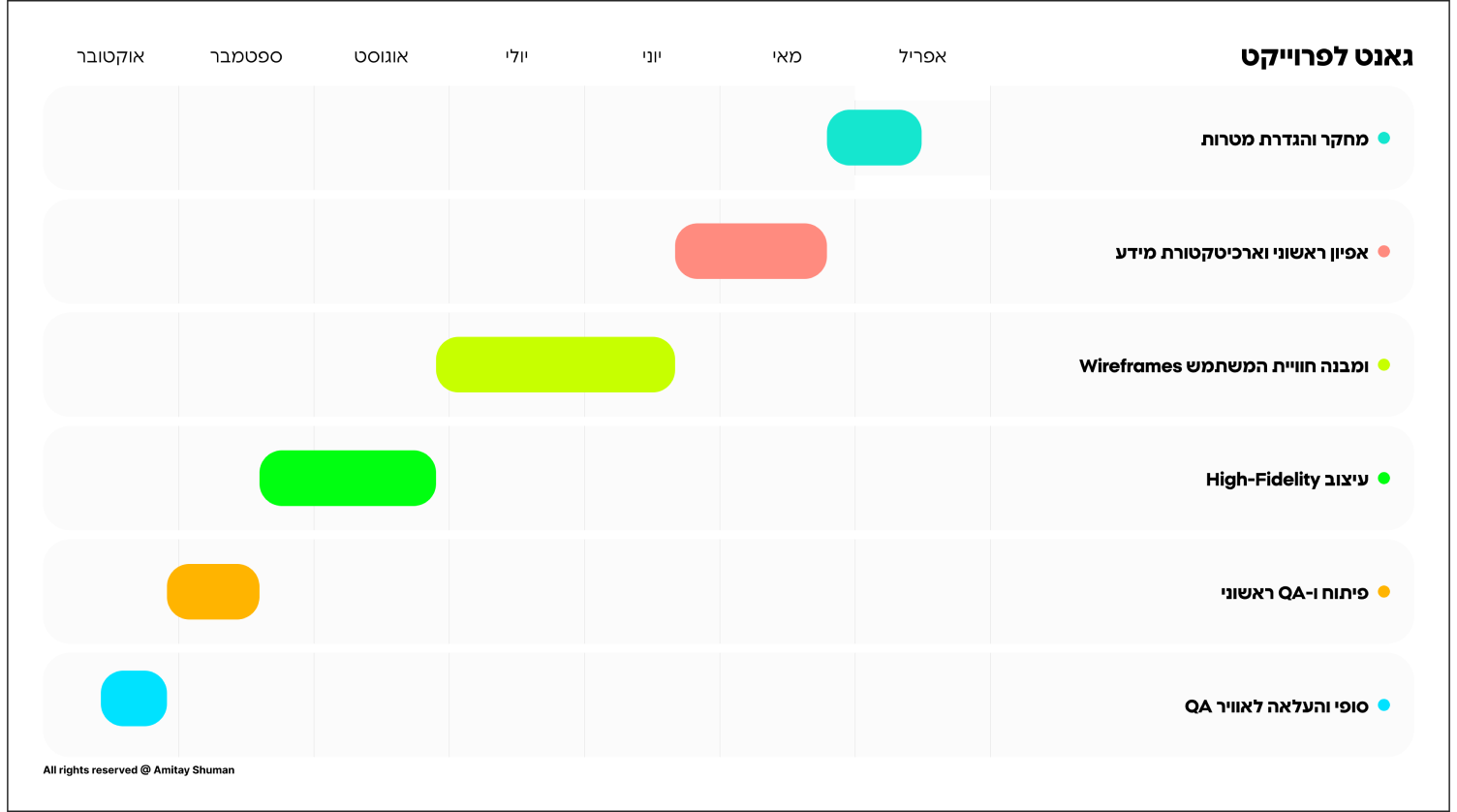
3 Months
Team
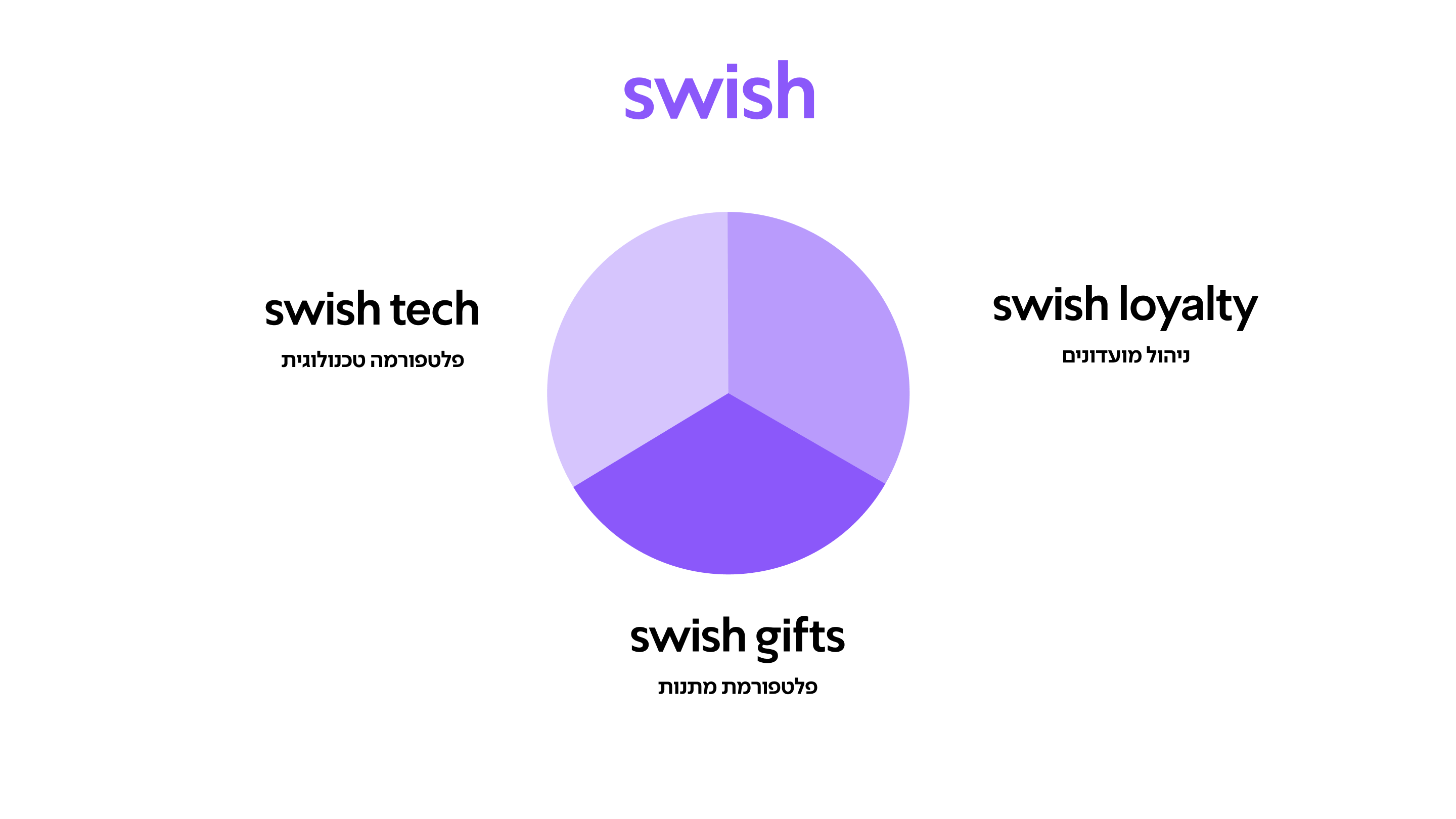
2 UX Designers, 1 UI Designer 1 Product Manager
Live Website


AI Summary
This comprehensive case study examines the complete redesign of TechStyle's e-commerce platform, which resulted in a 145% increase in conversion rates and a 78% improvement in user satisfaction scores. The project involved extensive user research, iterative prototyping, and a phased rollout strategy that minimized disruption to existing customers while introducing modern design patterns and improved functionality.
Overview
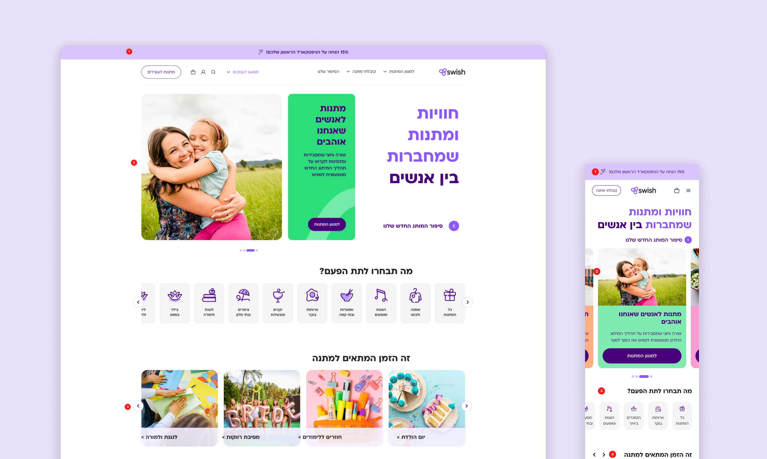
Swish (Nofshonit), a major gift card platform, needed to overhaul its outdated website. The existing platform frustrated users with a confusing purchase process and lacked critical e-commerce features. As the lead designer, I led the end-to-end redesign, creating an intuitive, modern platform that fixed key user frustrations, elevated the B2B services, and resulted in higher sales across the board.
The Problem
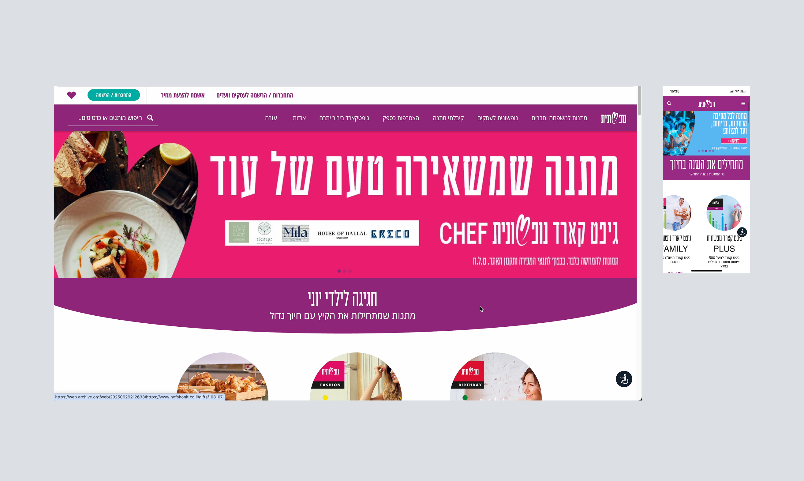
The Swish website was facing several critical challenges that created a poor user experience and limited its business potential, including a confusing purchase flow, an outdated design, missing features like multi-purchase, and a poorly marketed B2B offering.
Project Goals
To address the platform's shortcomings, I established three primary goals to guide the redesign:
- Simplify the user journey by redesigning the purchase flow to be intuitive and frictionless.
- Drive business growth by increasing B2C conversion and creating a clear funnel for B2B clients.
- Modernize the brand experience by aligning the visual identity with the new branding to build user trust.

How might we transform Swish’s platform into a unified, intuitive experience that serves both individual and corporate customers, simplifies complex purchase flows, and strengthens brand consistency — while also driving engagement and sales growth?
Design Process
Research
Understanding the Users & Business Goals
I began with a deep dive into the existing platform, conducting a heuristic evaluation and analyzing user feedback to identify key pain points. The research confirmed that users were frustrated by a confusing navigation, a complex checkout process, and the inability to buy multiple items at once. These insights were crucial in defining the project's direction.
- Qualitative interviews with users - We interviewed 8 in total, 4 frequent buyers, 4 infrequent buyers.
- Stakeholders Inteviews
- Market research - E-commerce, Gift cards & more.
- Analytics research - Google Analytics.
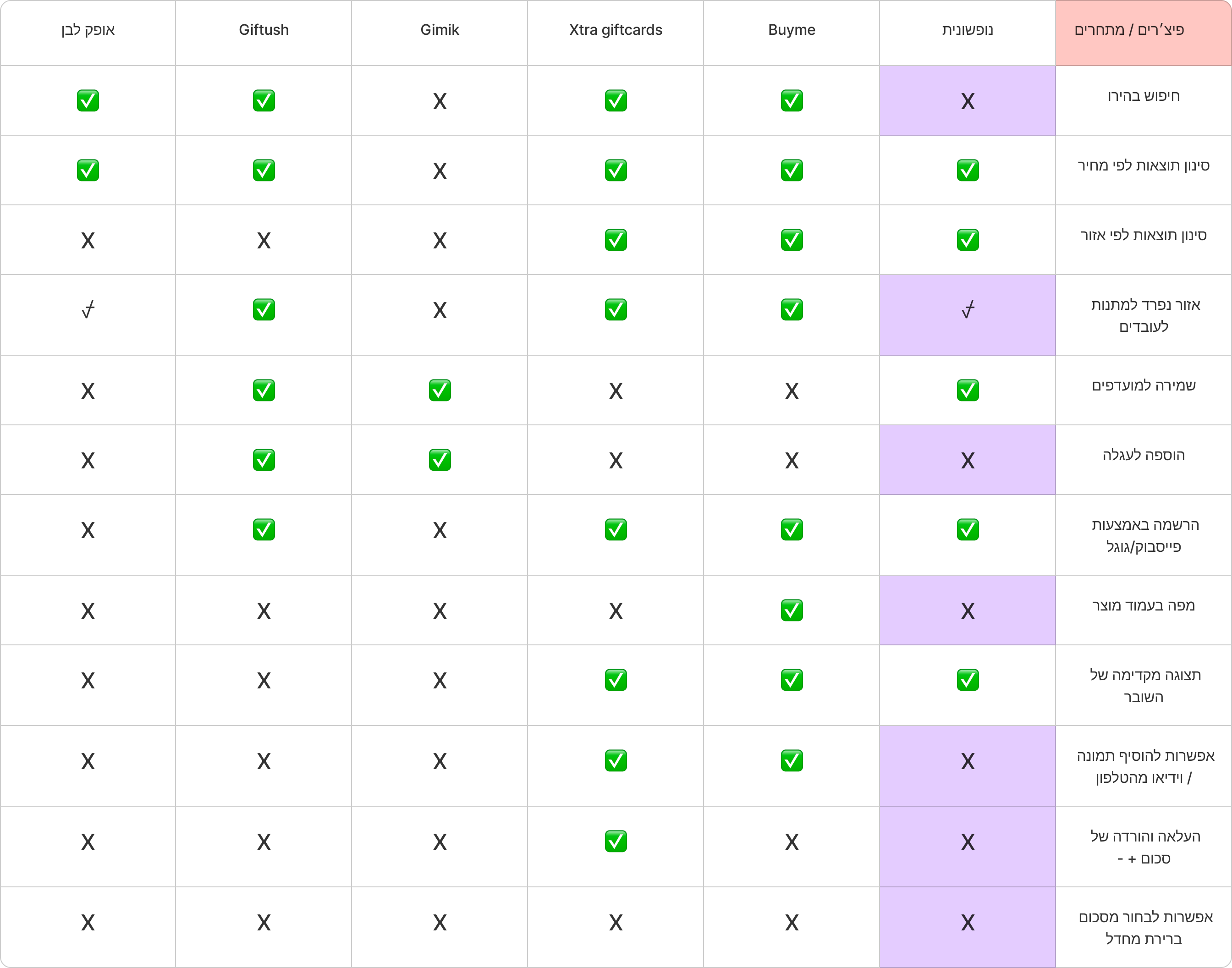
- Feature table - Competitor feature benchmark.
Competetive Analysis
We conducted competitive research to gain insights into the features and solutions of our competitors. Identifying 4 of our direct competitors was the first step. Then we created a comparison matrix based on 45 criteria, including Nielsen’s heuristics. Based on this matrix, we came up with features that positioned our product above our competitors.
Syntheszing into clear insights
I conducted user interviews, competitor benchmarking, and analytics reviews to understand the needs of both audience types.
Key Findings:
1
Gift discovery was confusing and frustrating due to unclear categories and navigation.
68% struggled to find gifts due to confusing site structure.
"I felt like I was going in circles. I knew they had restaurant gift cards, but I just couldn't find them and gave up."
2
The checkout process felt untrustworthy and impersonal, causing users to hesitate before entering payment details.
68% struggled to find gifts due to confusing site structure.
"I felt like I was going in circles. I knew they had restaurant gift cards, but I just couldn't find them and gave up."
3
Users wanted personal touches like customizable greetings and image uploads to make gifts feel special.
72% of users stated that the ability to add a personal touch would significantly improve their gifting experience.
"I was sending this for a birthday, and I really wanted to add my own photo and a longer message. It just felt too generic without it."
Define
Define new Information Architecture
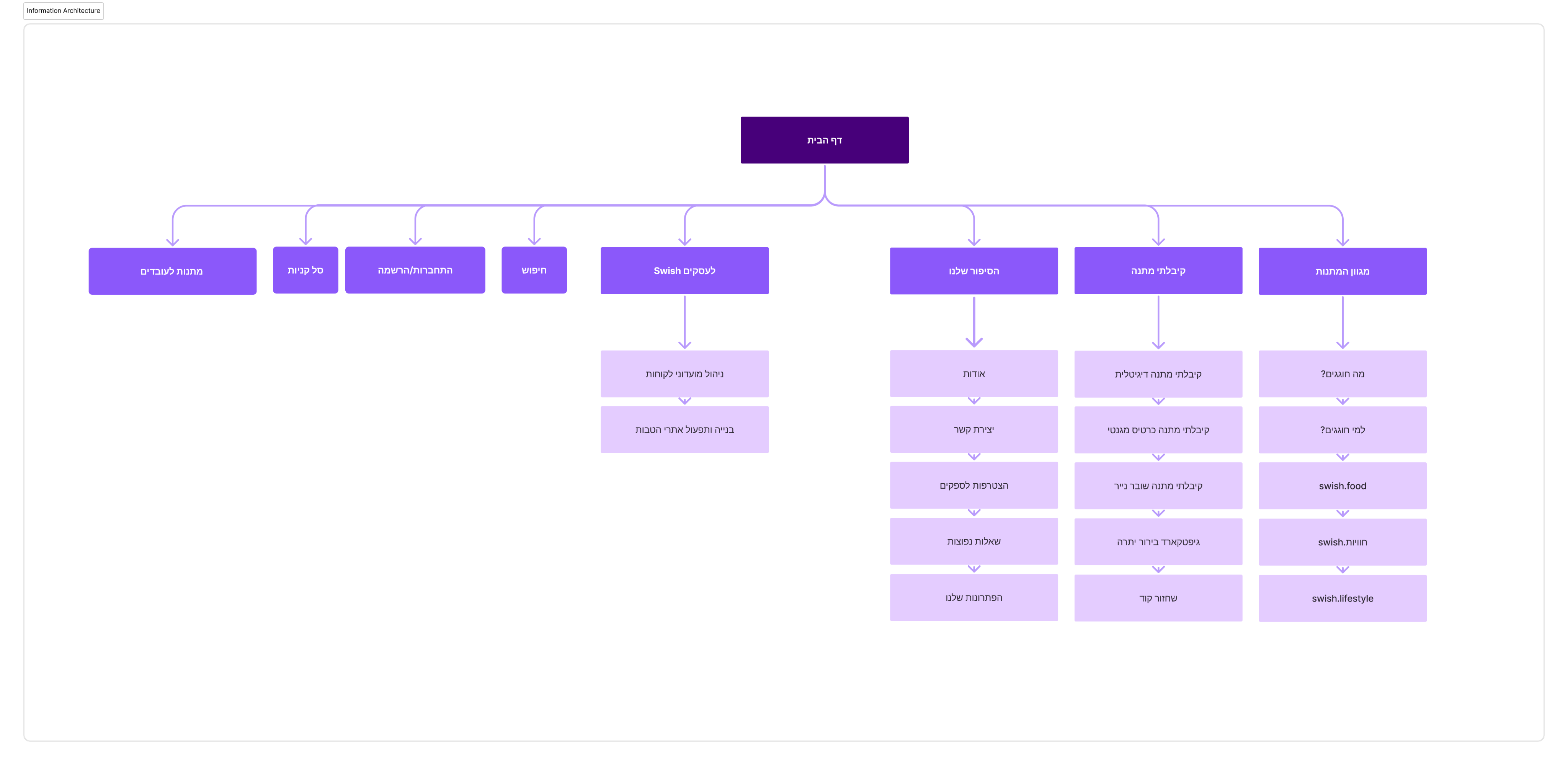
I restructured the navigation to clearly separate product categories while providing quick entry points for both personal and corporate users. The IA emphasized discoverability of seasonal offers and reduced navigation time.
New and faster purchase flow
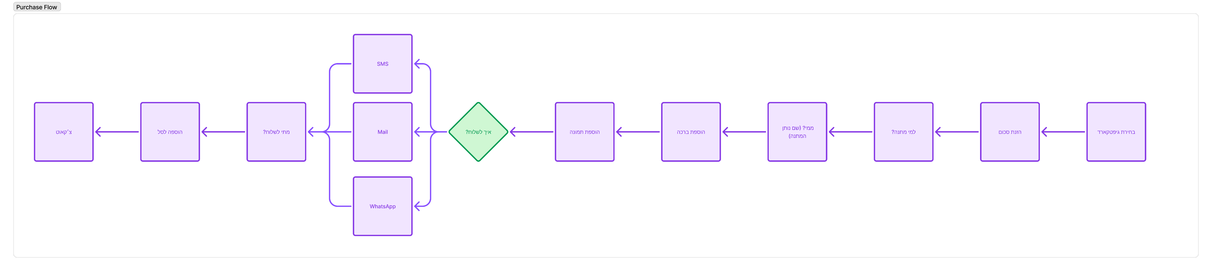
I mapped the end-to-end user journey, charting every touchpoint from landing on the homepage to finalizing a purchase. Key moments included initial impression of the brand, searching for a suitable gift, adding items to the cart, and navigating checkout. Pain points surfaced at moments of confusion during discovery, lack of feedback when customizing gifts, and hesitation during payment. These touchpoints revealed clear opportunities to introduce guidance, trust signals, and delightful personal touches that would turn friction into confidence and joy.
• Reduced steps for individual purchases.
• Added dedicated bulk-order and customization paths for corporate clients.
• Ensured both paths converge into a unified, branded checkout experience.
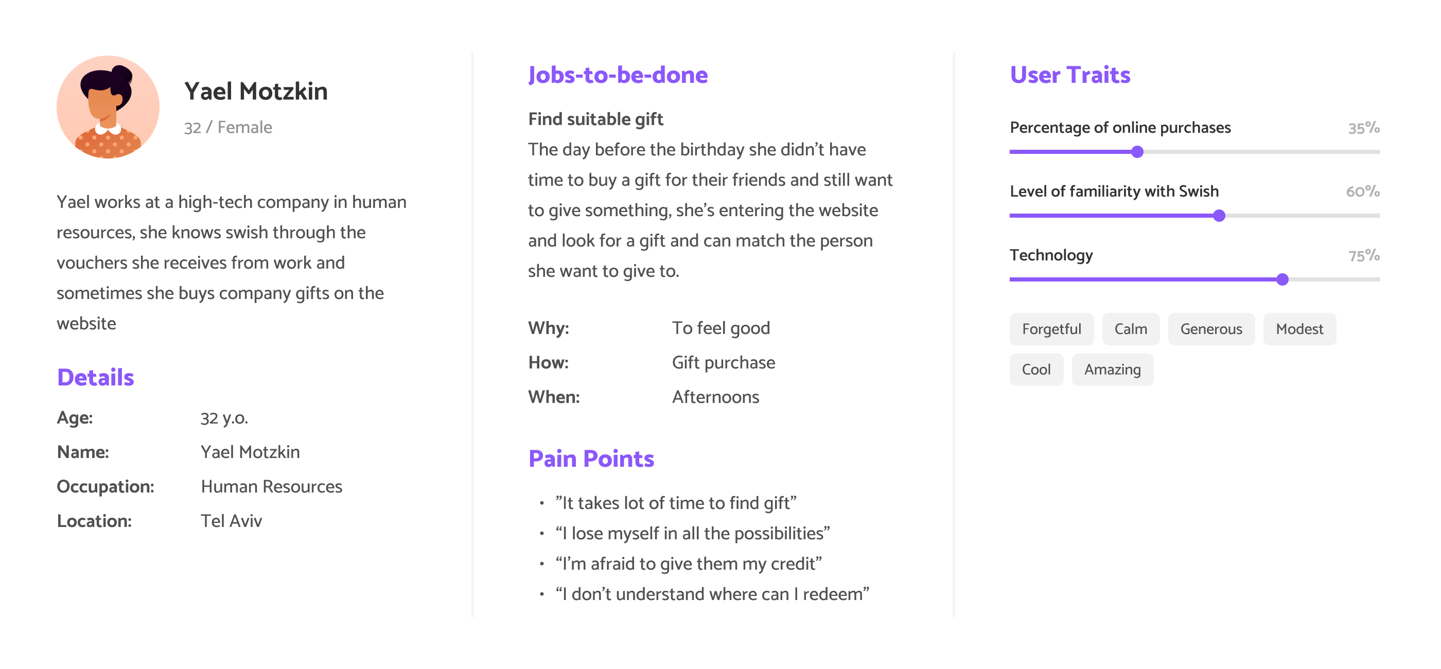
User Persona
I mapped the end-to-end user journey, charting every touchpoint from landing on the homepage to finalizing a purchase. Key moments included initial impression of the brand, searching for a suitable gift, adding items to the cart, and navigating checkout. Pain points surfaced at moments of confusion during discovery, lack of feedback when customizing gifts, and hesitation during payment. These touchpoints revealed clear opportunities to introduce guidance, trust signals, and delightful personal touches that would turn friction into confidence and joy.
• Reduced steps for individual purchases.
• Added dedicated bulk-order and customization paths for corporate clients.
• Ensured both paths converge into a unified, branded checkout experience.
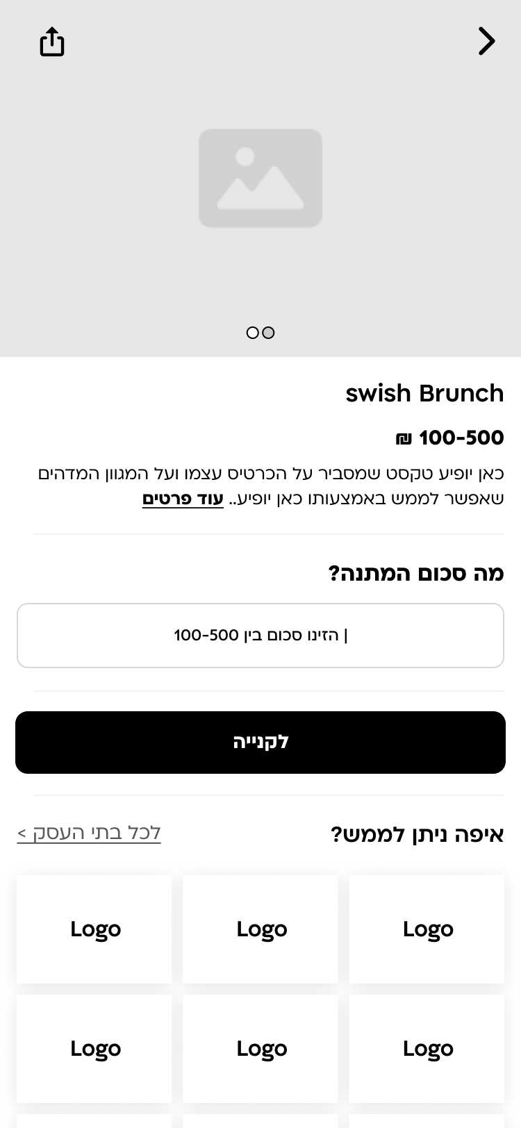
Selected UX Screens
Gift description page
Product page with all the information is crucial in first fold
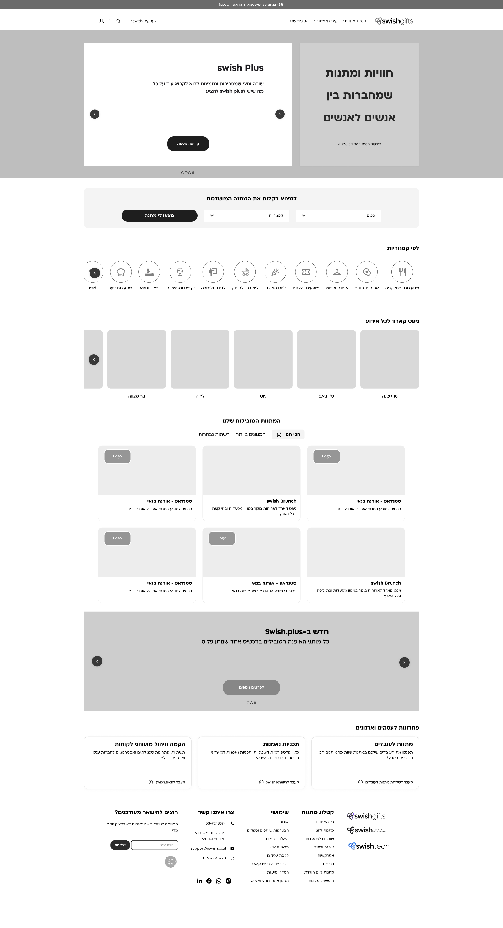
Homepage
Designed to help the users to navigate and find gifts easy.
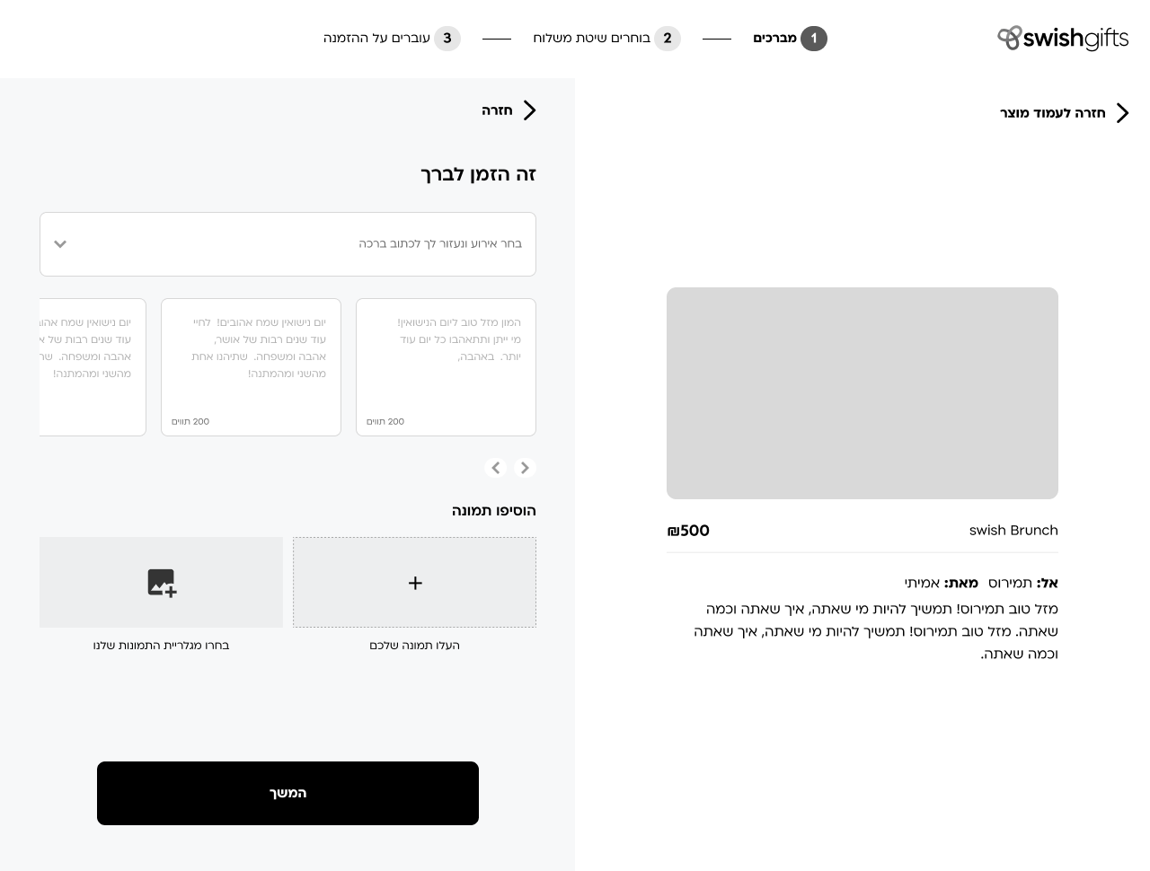
Checkout
Designed to help the users to navigate and find gifts easy.
Final Design
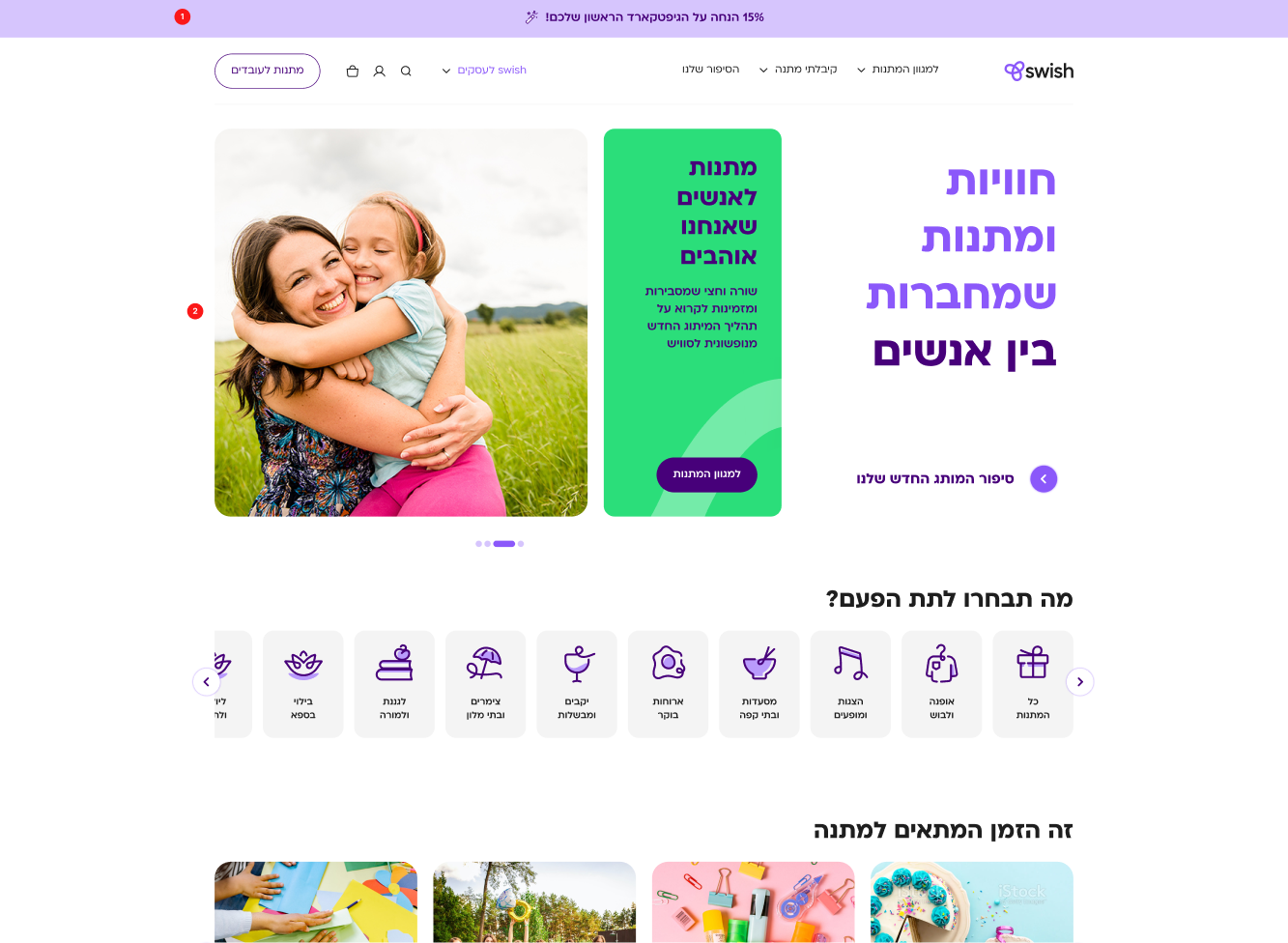
The Outcome
Learning
- Trust is the foundation of e-commerce; every interaction must reinforce it for conversion.
- Regular, cross-discipline collaboration is vital for consistency and speed during redesigns.
- Thorough research up front prevents costly missteps and anchors all design decisions.
From the buisness side
The redesign delivered immediate, measurable business value. Swish saw a noticeable surge in purchases within the first week, validating our focus on trust and simplicity. The streamlined checkout and new shopping cart directly reduced abandonment, while the modern, cohesive brand presence fostered greater B2B engagement and corporate sales. The project reestablished Swish’s reputation as a forward-thinking leader in digital gifting.
More Projects
UX at Scale
Design System
Designing for Scale
at Bank Leumi
How I drove UX consistency and managed product complexity for a 1M+ user banking app.
UX Designer
App&Web
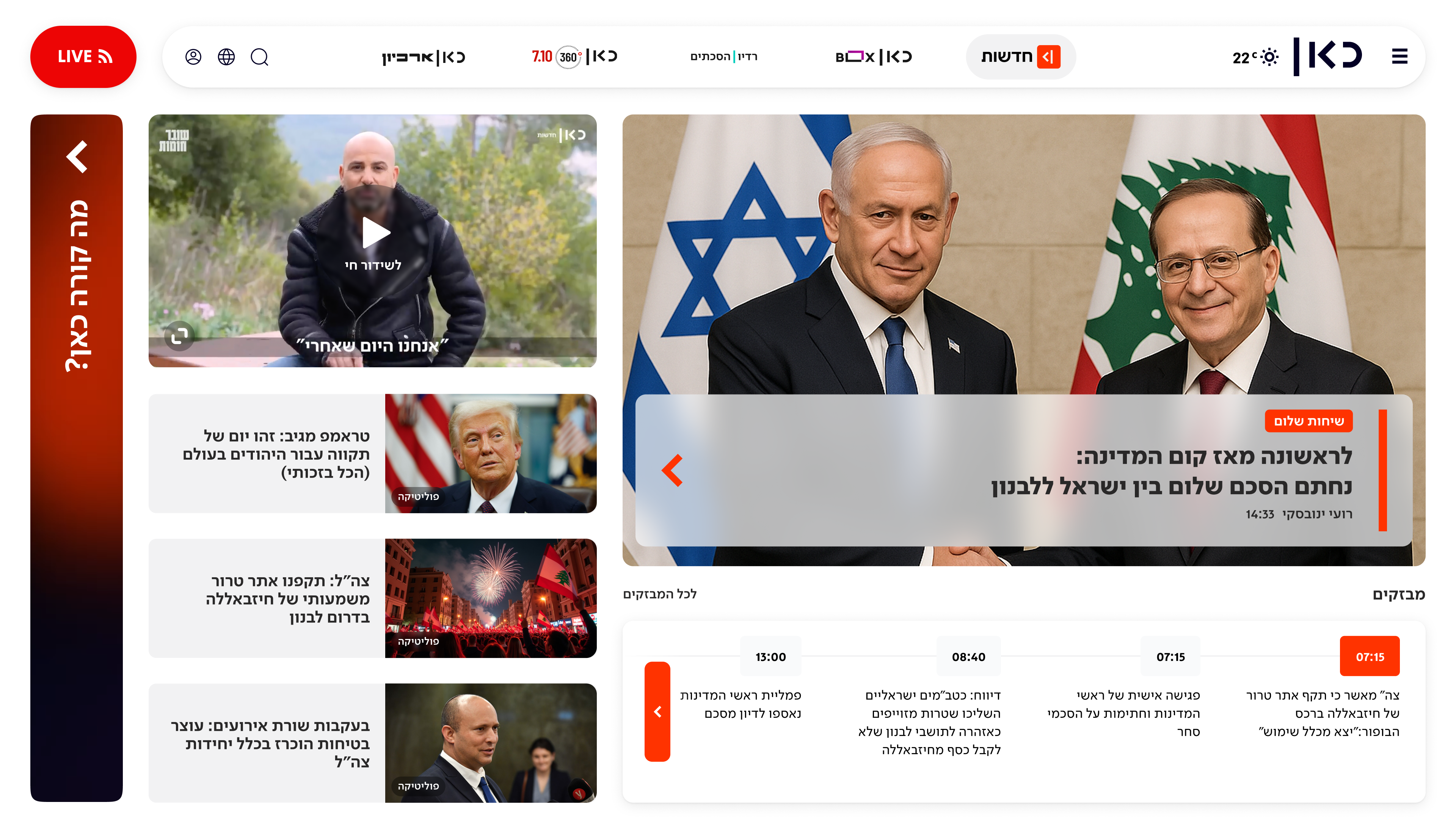
Redesigning Kan Homepage
From a News Hub to a Personalized Content.
AI
Product Lead
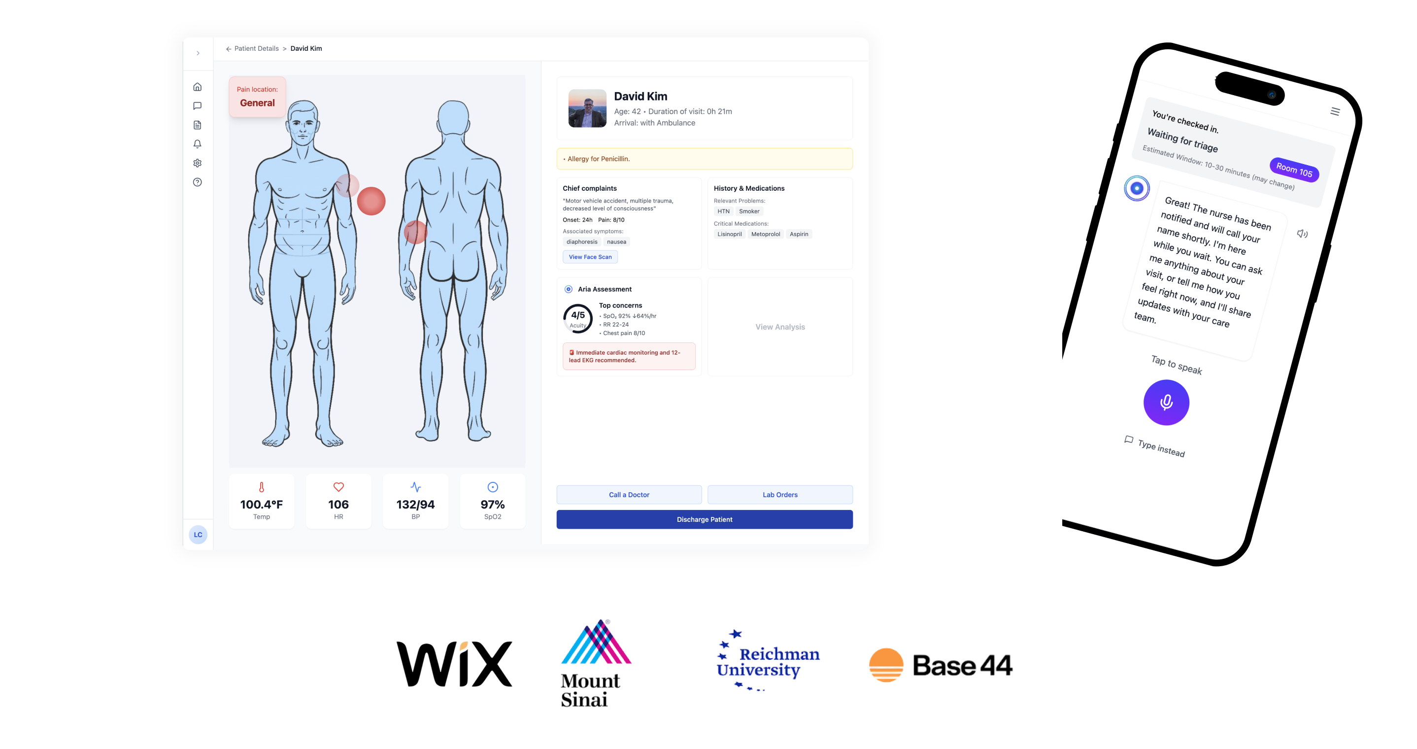
Aria.AI: Empowering ER Nurses with Smart Triage
Award-winning AI agent reduces cognitive overload and helps emergency room nurses prioritize patients with confidence and speed.
Home
About
2024
Re-designing Swish E-commerce Experience
Swish (aka ‘Nofshonit’)
E-Commerce
b2c
My Role
UX Designer (b2c)
Timeline
3 Months
Team
2 UX Designers, 1 UI Designer 1 Product Manager
Live Website

AI Summary
This comprehensive case study examines the complete redesign of TechStyle's e-commerce platform, which resulted in a 145% increase in conversion rates and a 78% improvement in user satisfaction scores. The project involved extensive user research, iterative prototyping, and a phased rollout strategy that minimized disruption to existing customers while introducing modern design patterns and improved functionality.
Overview
Swish (Nofshonit), a major gift card platform, needed to overhaul its outdated website. The existing platform frustrated users with a confusing purchase process and lacked critical e-commerce features. As the lead designer, I led the end-to-end redesign, creating an intuitive, modern platform that fixed key user frustrations, elevated the B2B services, and resulted in higher sales across the board.
The Problem
The Swish website was facing several critical challenges that created a poor user experience and limited its business potential, including a confusing purchase flow, an outdated design, missing features like multi-purchase, and a poorly marketed B2B offering.
Project Goals
To address the platform's shortcomings, I established three primary goals to guide the redesign:
- Simplify the user journey by redesigning the purchase flow to be intuitive and frictionless.
- Drive business growth by increasing B2C conversion and creating a clear funnel for B2B clients.
- Modernize the brand experience by aligning the visual identity with the new branding to build user trust.

How might we transform Swish’s platform into a unified, intuitive experience that serves both individual and corporate customers, simplifies complex purchase flows, and strengthens brand consistency — while also driving engagement and sales growth?
Design Process
Research
Understanding the Users & Business Goals
I began with a deep dive into the existing platform, conducting a heuristic evaluation and analyzing user feedback to identify key pain points. The research confirmed that users were frustrated by a confusing navigation, a complex checkout process, and the inability to buy multiple items at once. These insights were crucial in defining the project's direction.
- Qualitative interviews with users - We interviewed 8 in total, 4 frequent buyers, 4 infrequent buyers.
- Stakeholders Inteviews
- Market research - E-commerce, Gift cards & more.
- Analytics research - Google Analytics.
- Feature table - Competitor feature benchmark.
Competitive Analysis
We conducted competitive research to gain insights into the features and solutions of our competitors. Identifying 4 of our direct competitors was the first step. Then we created a comparison matrix based on 45 criteria, including Nielsen’s heuristics. Based on this matrix, we came up with features that positioned our product above our competitors.
Synthesising into clear insights
I conducted user interviews, competitor benchmarking, and analytics reviews to understand the needs of both audience types.
Key Findings:
1
Gift discovery was confusing and frustrating due to unclear categories and navigation.
68% struggled to find gifts due to confusing site structure.
"I felt like I was going in circles. I knew they had restaurant gift cards, but I just couldn't find them and gave up."
2
The checkout process felt untrustworthy and impersonal, causing users to hesitate before entering payment details.
68% struggled to find gifts due to confusing site structure.
"I felt like I was going in circles. I knew they had restaurant gift cards, but I just couldn't find them and gave up."
3
Users wanted personal touches like customizable greetings and image uploads to make gifts feel special.
72% of users stated that the ability to add a personal touch would significantly improve their gifting experience.
"I was sending this for a birthday, and I really wanted to add my own photo and a longer message. It just felt too generic without it."
Define
Define new Information Architecture
I restructured the navigation to clearly separate product categories while providing quick entry points for both personal and corporate users. The IA emphasized discoverability of seasonal offers and reduced navigation time.
New and faster purchase flow
I mapped the end-to-end user journey, charting every touchpoint from landing on the homepage to finalizing a purchase. Key moments included initial impression of the brand, searching for a suitable gift, adding items to the cart, and navigating checkout. Pain points surfaced at moments of confusion during discovery, lack of feedback when customizing gifts, and hesitation during payment. These touchpoints revealed clear opportunities to introduce guidance, trust signals, and delightful personal touches that would turn friction into confidence and joy.
• Reduced steps for individual purchases.
• Added dedicated bulk-order and customization paths for corporate clients.
• Ensured both paths converge into a unified, branded checkout experience.
User Persona
I mapped the end-to-end user journey, charting every touchpoint from landing on the homepage to finalizing a purchase. Key moments included initial impression of the brand, searching for a suitable gift, adding items to the cart, and navigating checkout. Pain points surfaced at moments of confusion during discovery, lack of feedback when customizing gifts, and hesitation during payment. These touchpoints revealed clear opportunities to introduce guidance, trust signals, and delightful personal touches that would turn friction into confidence and joy.
• Reduced steps for individual purchases.
• Added dedicated bulk-order and customization paths for corporate clients.
• Ensured both paths converge into a unified, branded checkout experience.
Selected UX Screens
Gift description page
with all the information is crucial in first fold
Homepage
Designed to help the users to navigate and find gifts easy.
Checkout
Designed to help the users to navigate and find gifts easy.
Final Design
The Outcome
From the business side
The redesign delivered immediate, measurable business value. Swish saw a noticeable surge in purchases within the first week, validating our focus on trust and simplicity. The streamlined checkout and new shopping cart directly reduced abandonment, while the modern, cohesive brand presence fostered greater B2B engagement and corporate sales. The project reestablished Swish’s reputation as a forward-thinking leader in digital gifting.
Learning
- Trust is the foundation of e-commerce; every interaction must reinforce it for conversion.
- Regular, cross-discipline collaboration is vital for consistency and speed during redesigns.
- Thorough research up front prevents costly missteps and anchors all design decisions.
More Projects
UX at Scale
Design System
Designing for Scale
at Bank Leumi
How I drove UX consistency and managed product complexity for a 1M+ user banking app.
UX Designer
App&Web
Redesigning Kan Homepage
From a News Hub to a Personalized Content.
AI
Product Lead
Aria.AI: Empowering ER Nurses with Smart Triage
Award-winning AI agent reduces cognitive overload and helps emergency room nurses prioritize patients with confidence and speed.