

2024
Designing for Scale
at Bank Leumi
Bank Leumi
UX At Scale
b2c
My Role
Senior UX Designer
Company
Bank Leumi
Timeline
2024-2025


AI Summary
As a Senior UX Designer at Bank Leumi, I led the end-to-end design for key features within a complex, highly regulated financial ecosystem. My role involved navigating strict legal and compliance requirements while designing for millions of users. I managed the Information Architecture for the core mobile app, created detailed UX specifications for our design system, and led the design for an omnichannel experience by redesigning the in-branch physical kiosks to align with our new digital-first strategy.
The Challenge: Content Overload vs. User Attention
The primary challenge at Leumi was not just designing features, but doing so within one of Israel's most complex and secure product environments.
My goal was to untangle complex banking processes and present them as simple, accessible, and secure experiences for everyday users. This required balancing user needs against strict regulatory/legal constraints, legacy technical limitations, and the business's strategic goals.
My Process & Leadership
As a senior designer, my responsibilities went beyond wireframes. I owned the full UX process:
Discovery & Collaboration:
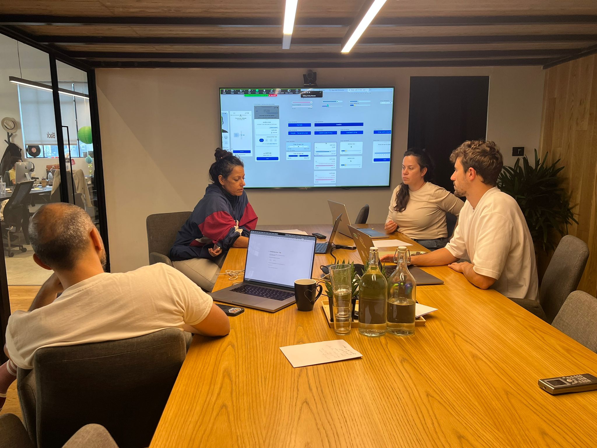
Working with PMs to define problem statements and KPIs.
In Charge of the App Information Architecture (IA):
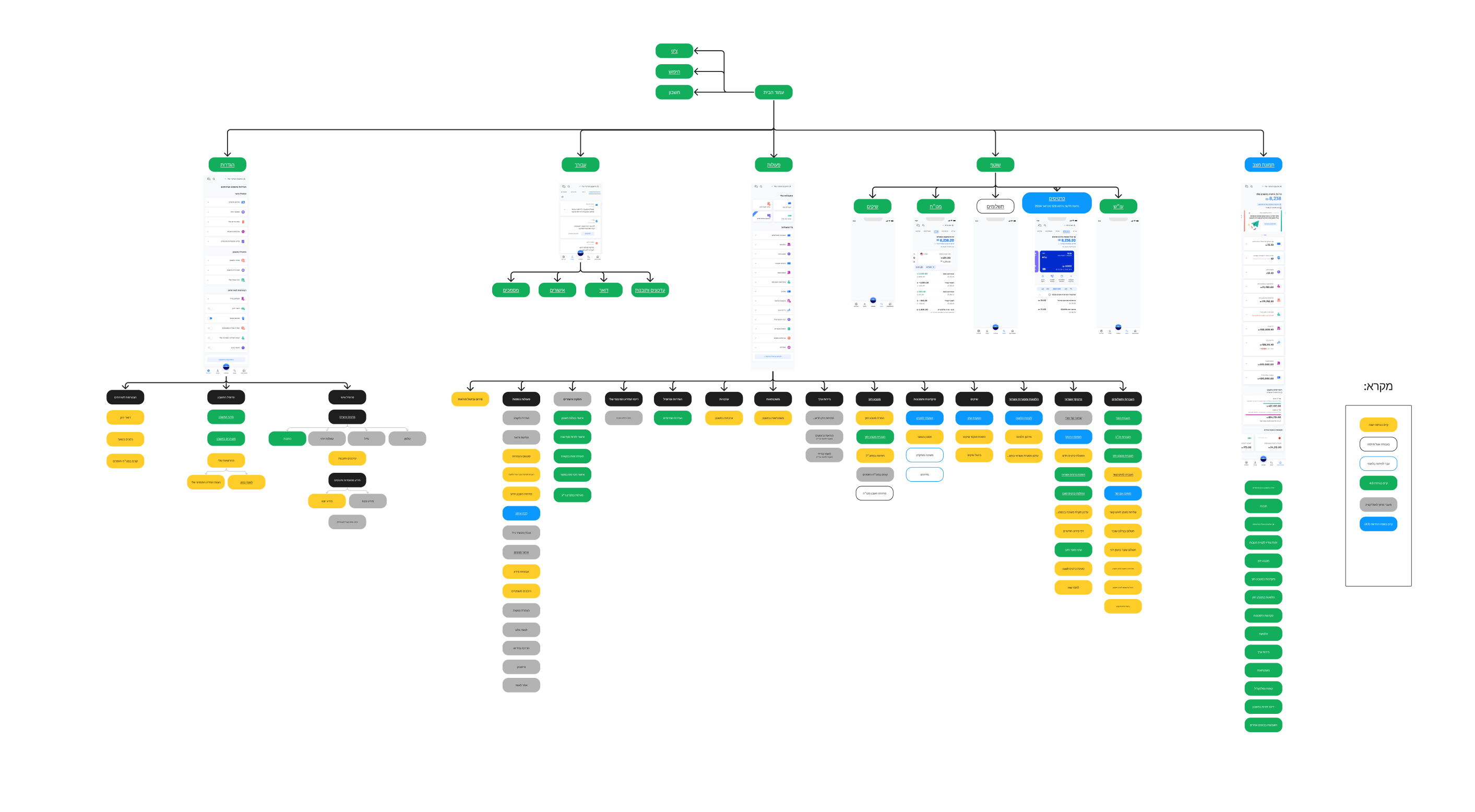
I created and maintained the visual sitemap for the Leumi mobile app. This became a "single source of truth" that aligned all teams (product, dev, and management) on the app's structure and user flows.
End-to-End UX/UI:
Designing user flows, wireframes, and high-fidelity prototypes.
Expanding the Design System
We created a new design system for Leumi, and i was in charge of all the UX Spec and handoff instructions.
UX Specifications & Handof
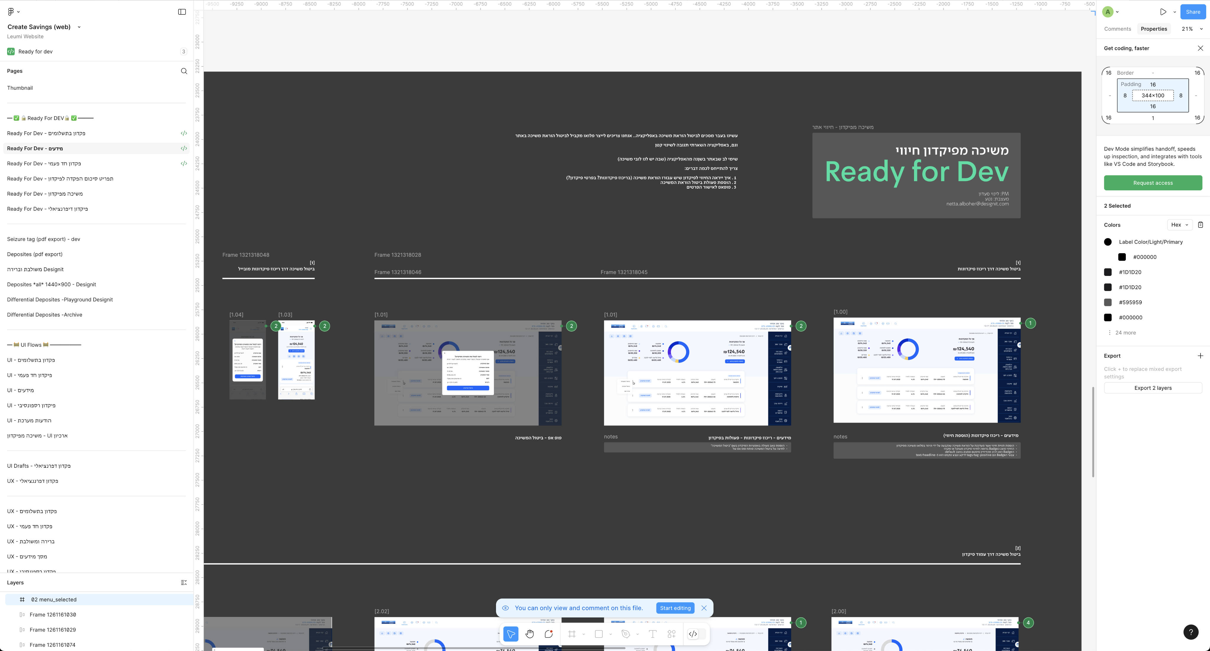
In each feature i designed i was accountable to deliver all the spec for the Developers
Create new design language for leumi website app
Additional Side Project: Kiosk & TV Redesign
Overview
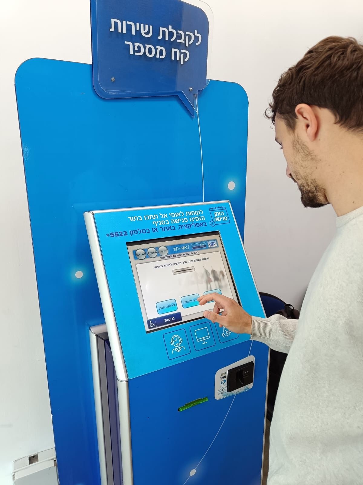
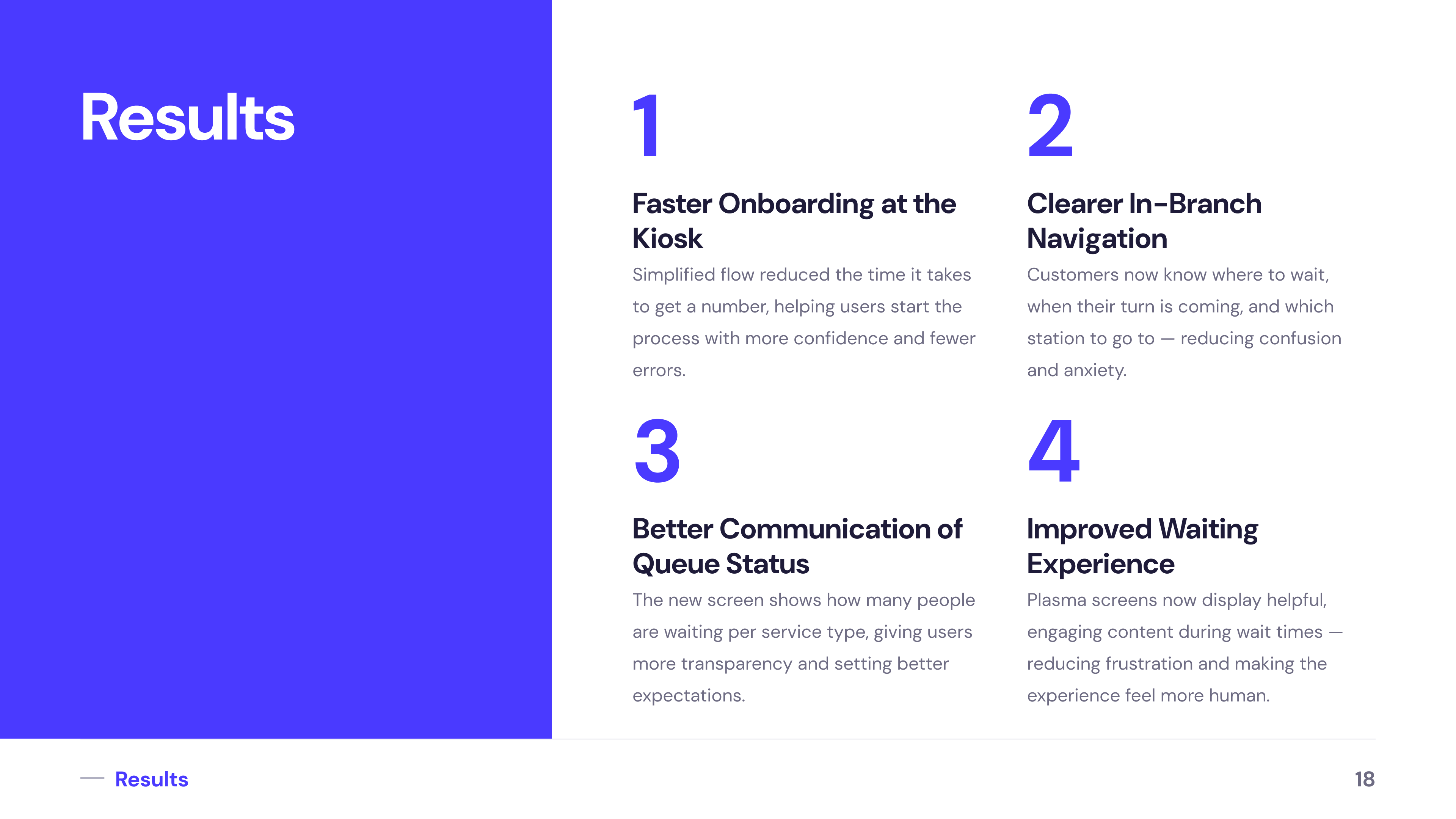
As part of improving the in-branch experience at Bank Leumi, I redesigned the kiosk interface for taking a number and the accompanying TV screens that display queue status.
The Challange

How might we reduce confusion, anxiety, and frustration in a high-pressure physical environment.
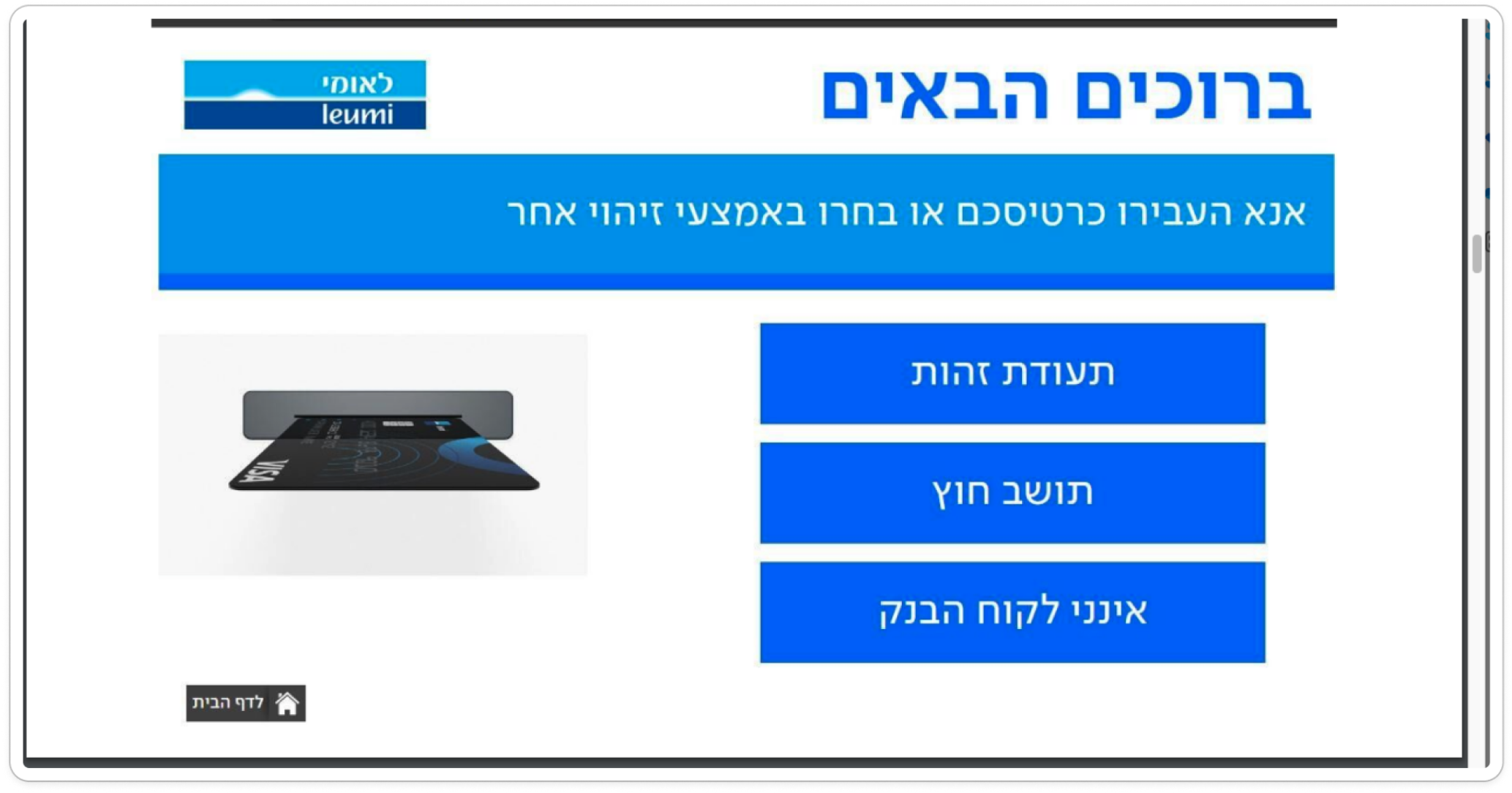
Old Kiosk Screen
The interface was cluttered and unintuitive, making it difficult for users to choose the right service. Key actions were buried or unclear, leading to mistakes and slower queue times.
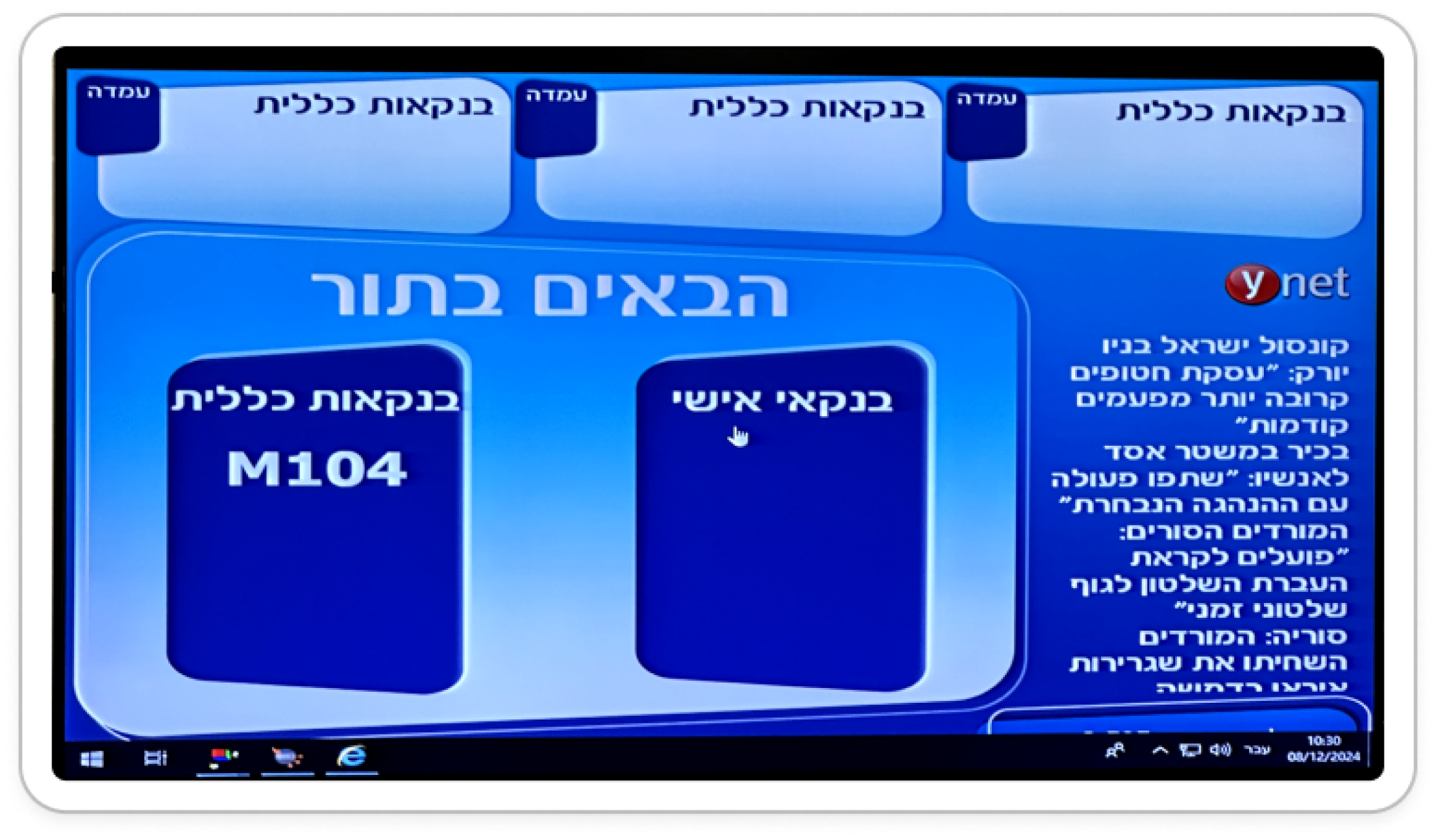
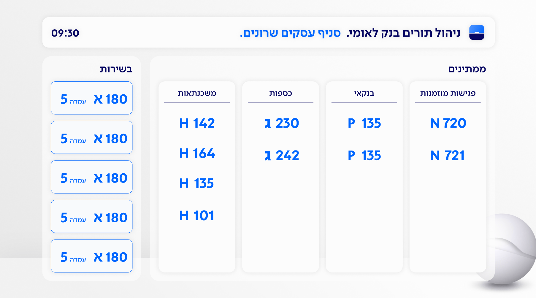
Old TV Screen
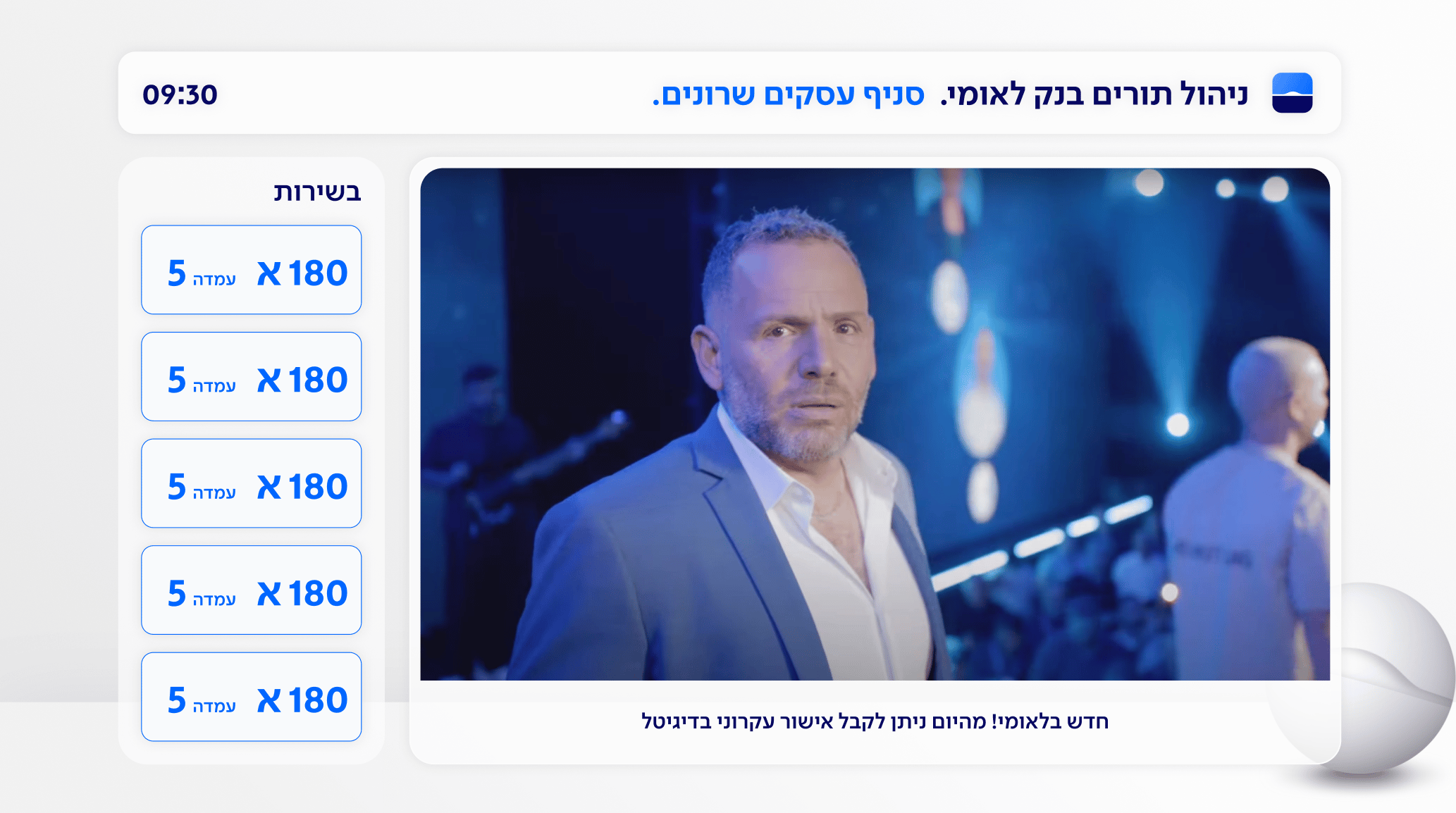
The display lacked clear visual hierarchy and didn’t communicate essential information such as wait times or station availability. Customers were left confused and uncertain about what to do next.
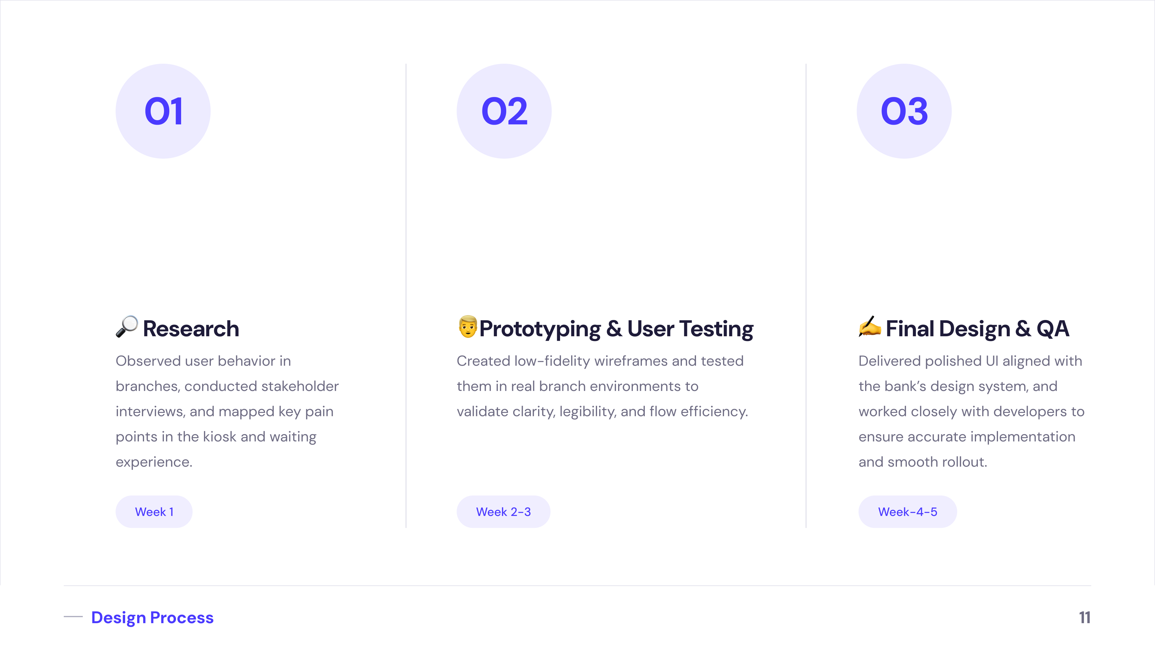
Design Process
Users Observations & Interviews
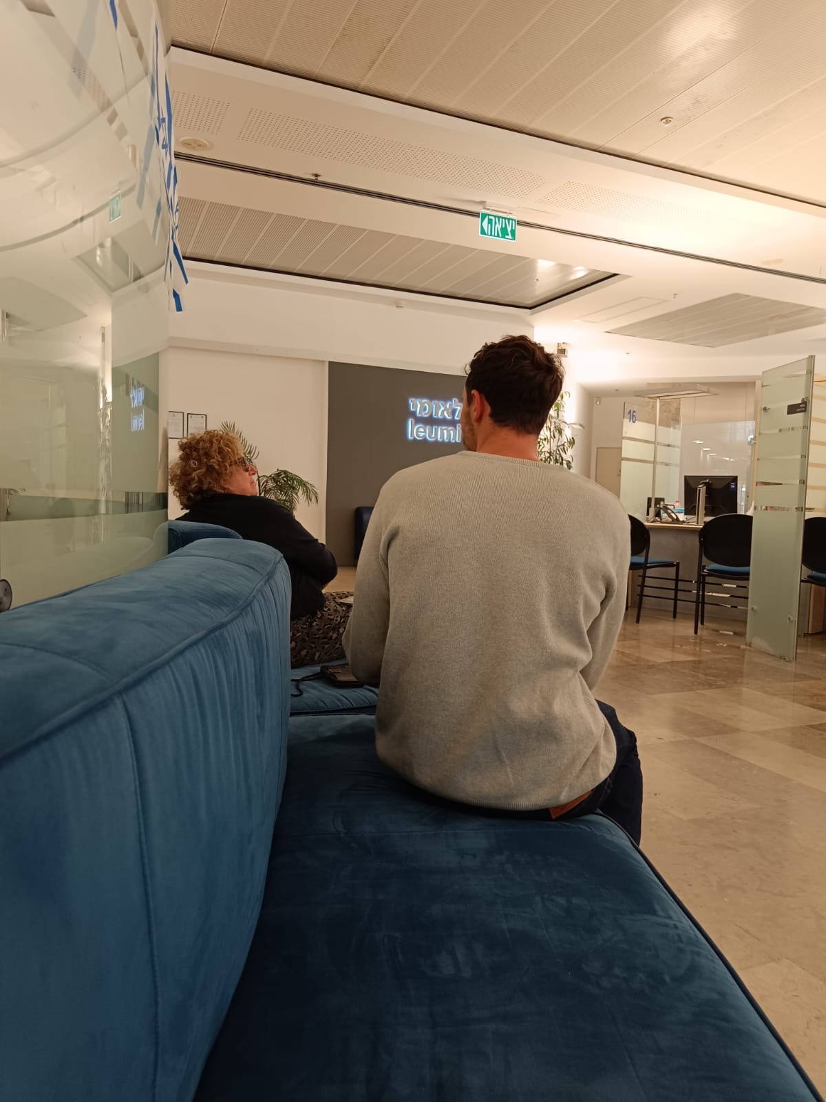
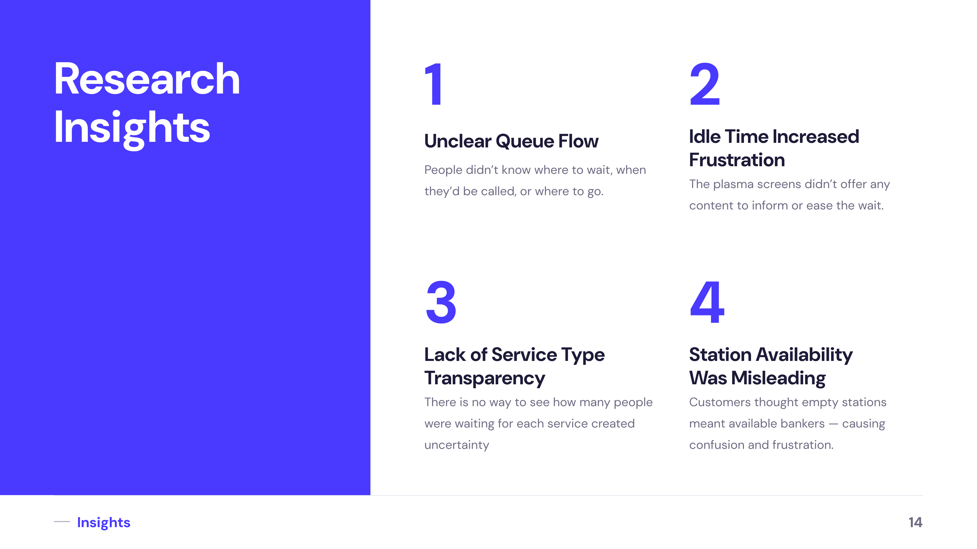
Through on-site observations, we saw that many customers hesitated at the kiosk, unsure which option to choose, and often needed assistance. At the waiting area, people frequently looked around in confusion, unsure if it was their turn or which station to approach. These behaviors highlighted a gap in clarity and guidance throughout the entire in-branch flow.
Users Observations & Interviews
As part of the research, I visited kiosks in banks and public spaces like McDonald’s, train stations, and government service centers. This helped me identify best practices in guiding users through time-sensitive flows, simplifying decision-making, and creating interfaces that reduce cognitive load. Insights from this benchmark research directly influenced the structure, clarity, and accessibility of our redesigned kiosk experience.
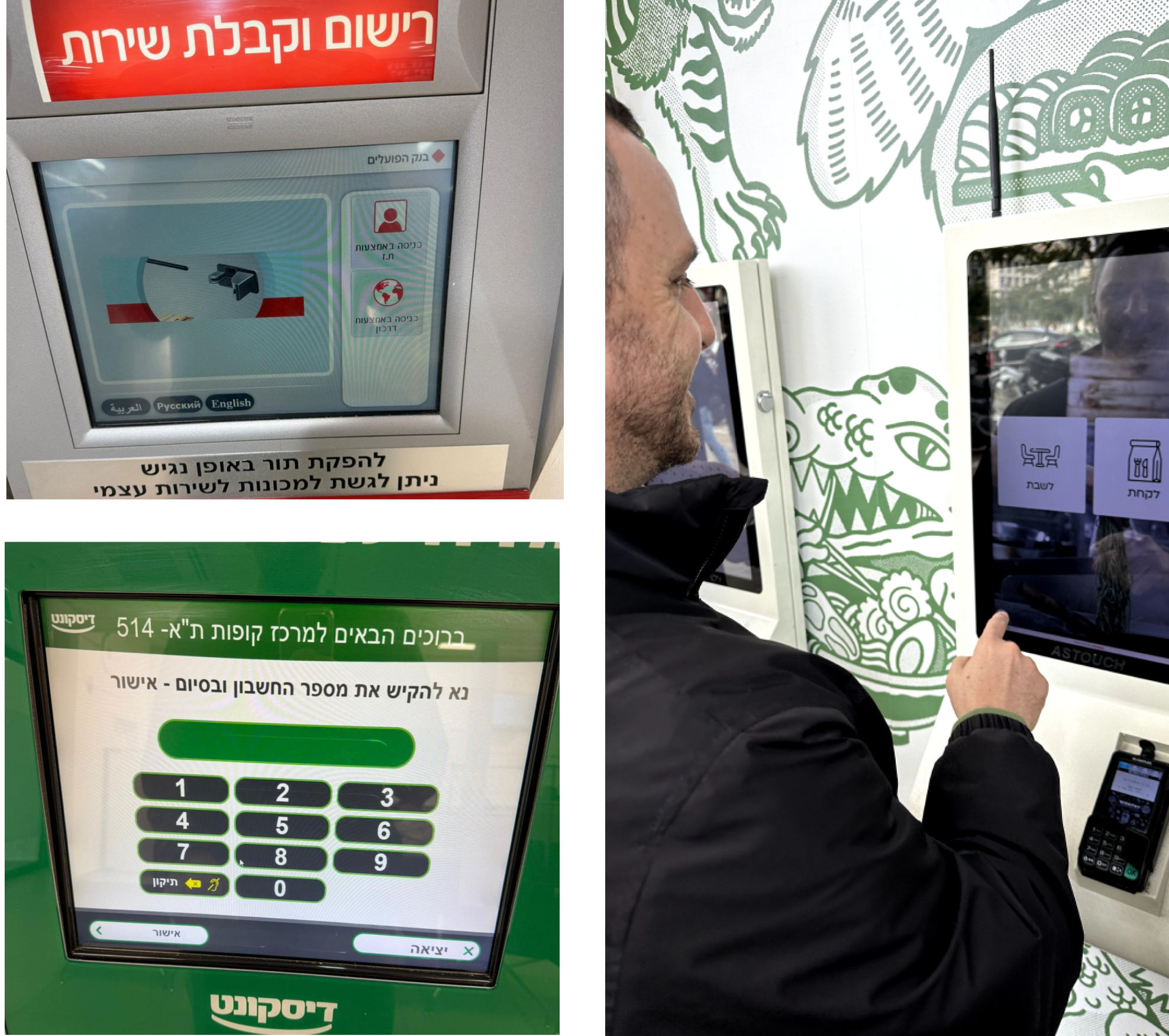
Users Observations & Interviews
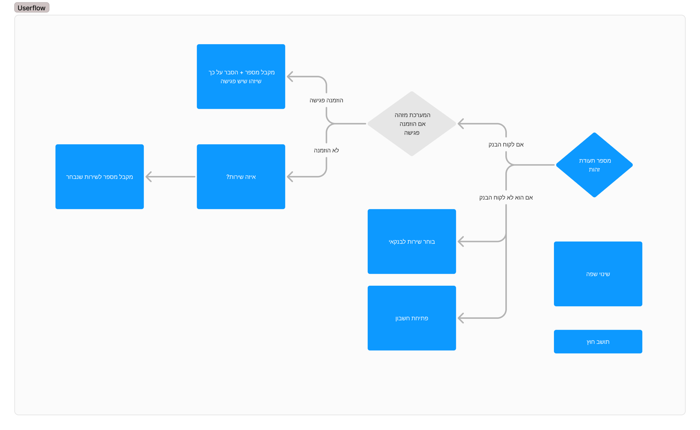
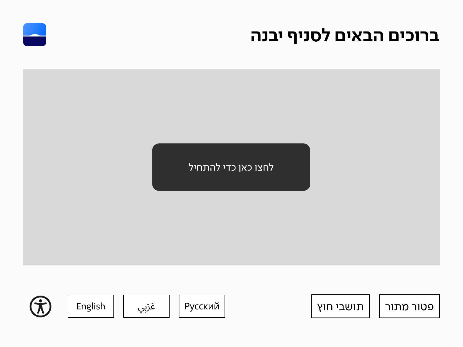
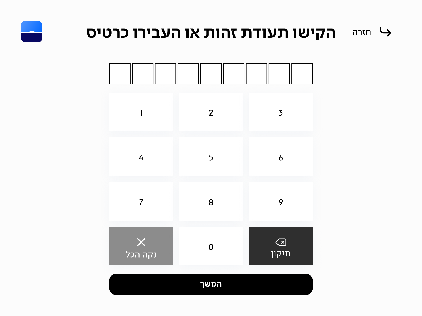
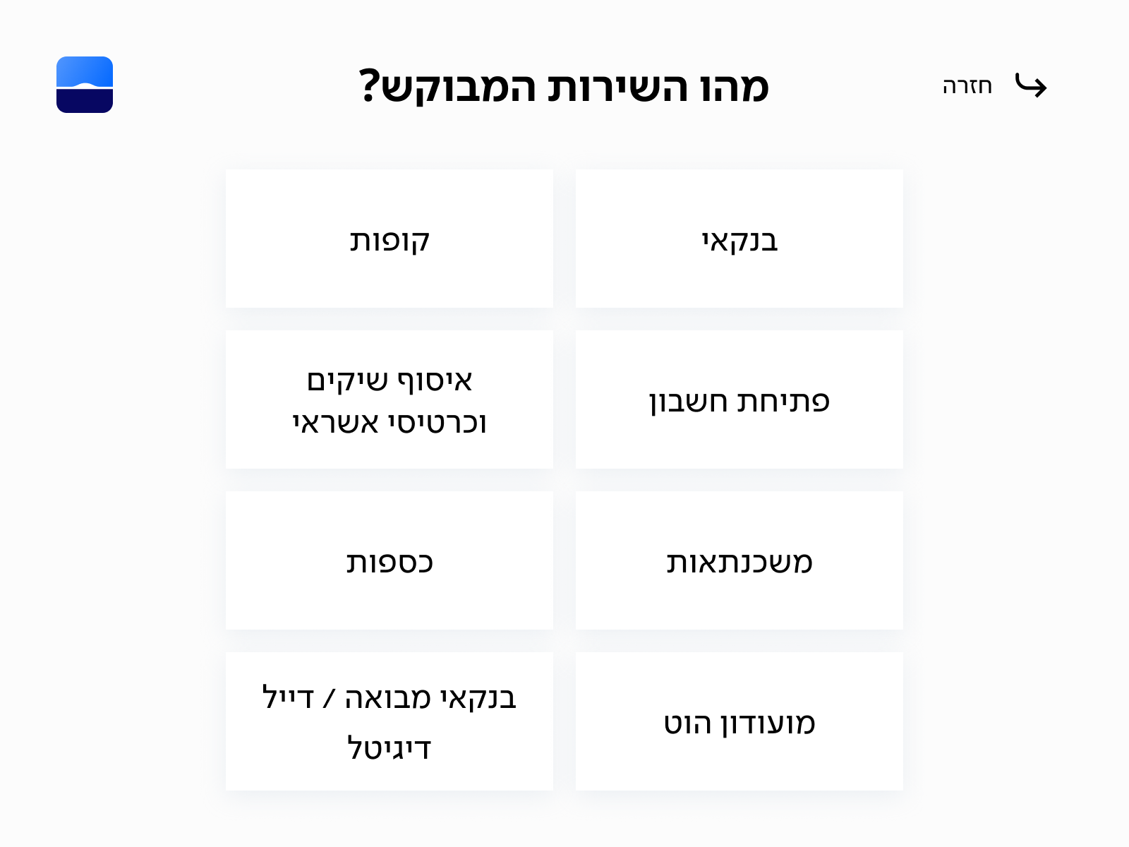
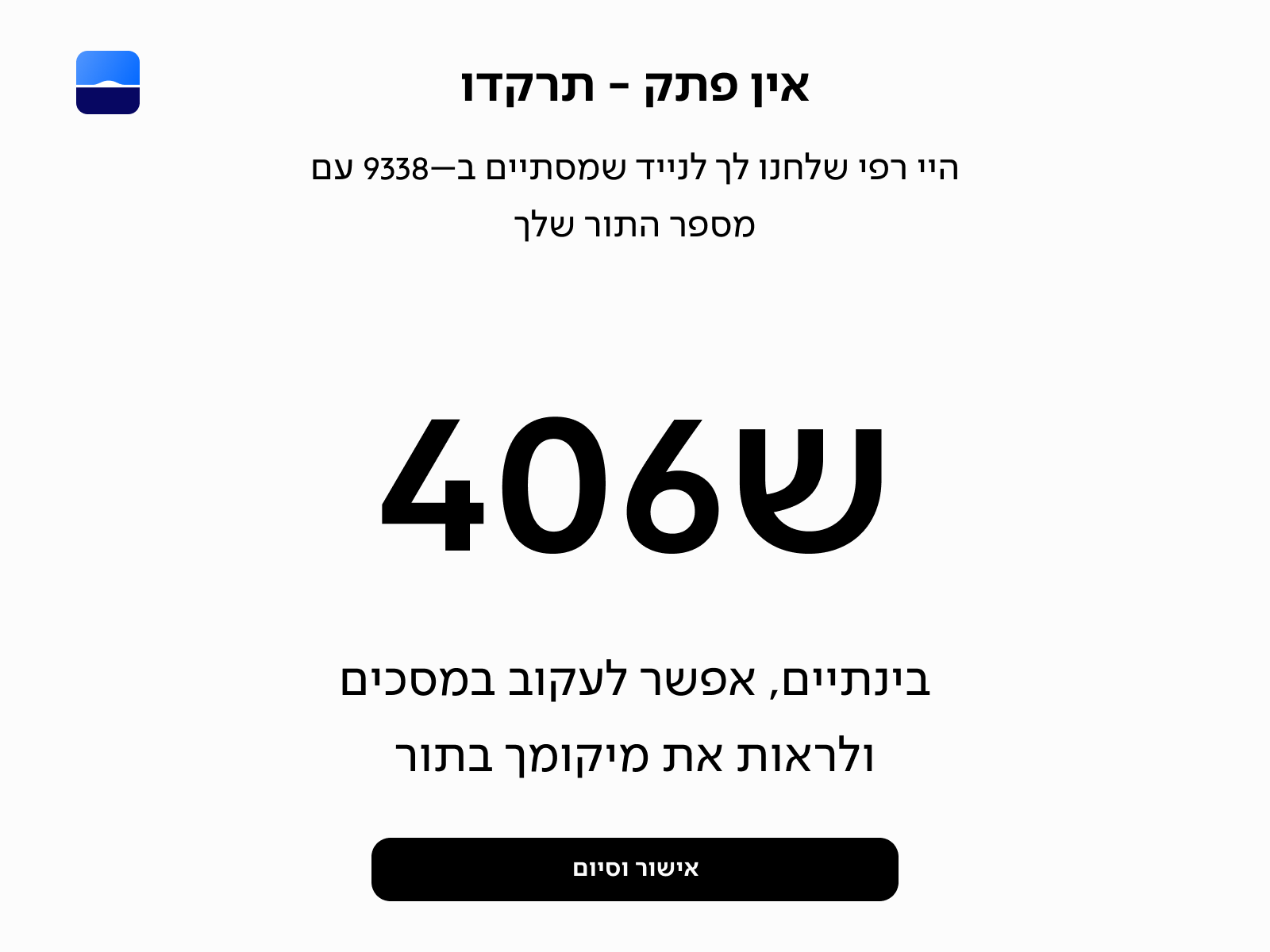
New Kiosk Flow
Based on the research inisghts I created a streamlined user flow for the kiosk that significantly reduced the time it takes for customers to complete the number-taking process, but also has a clear start and finish.
User Testing
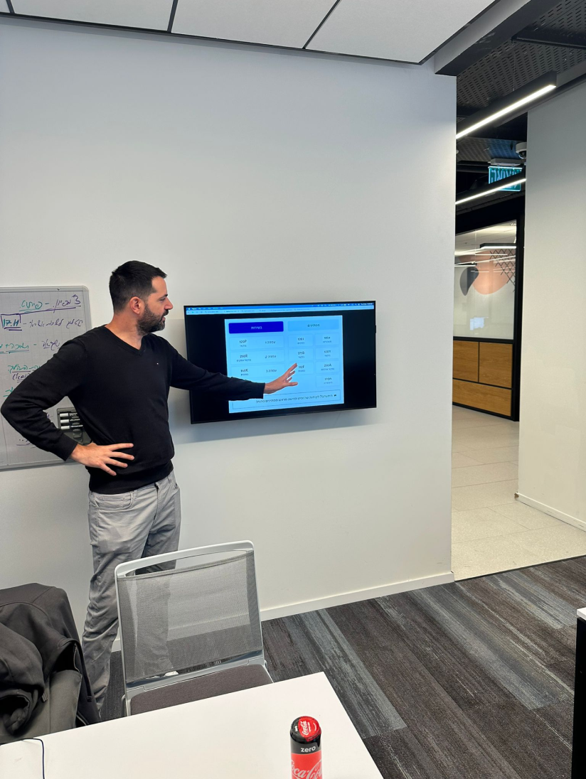
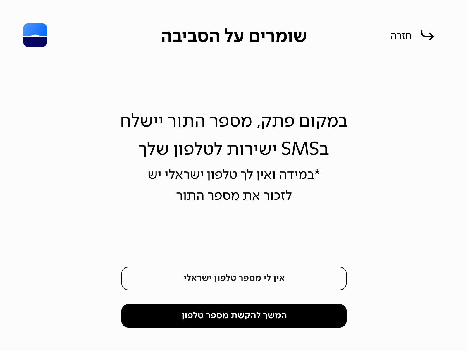
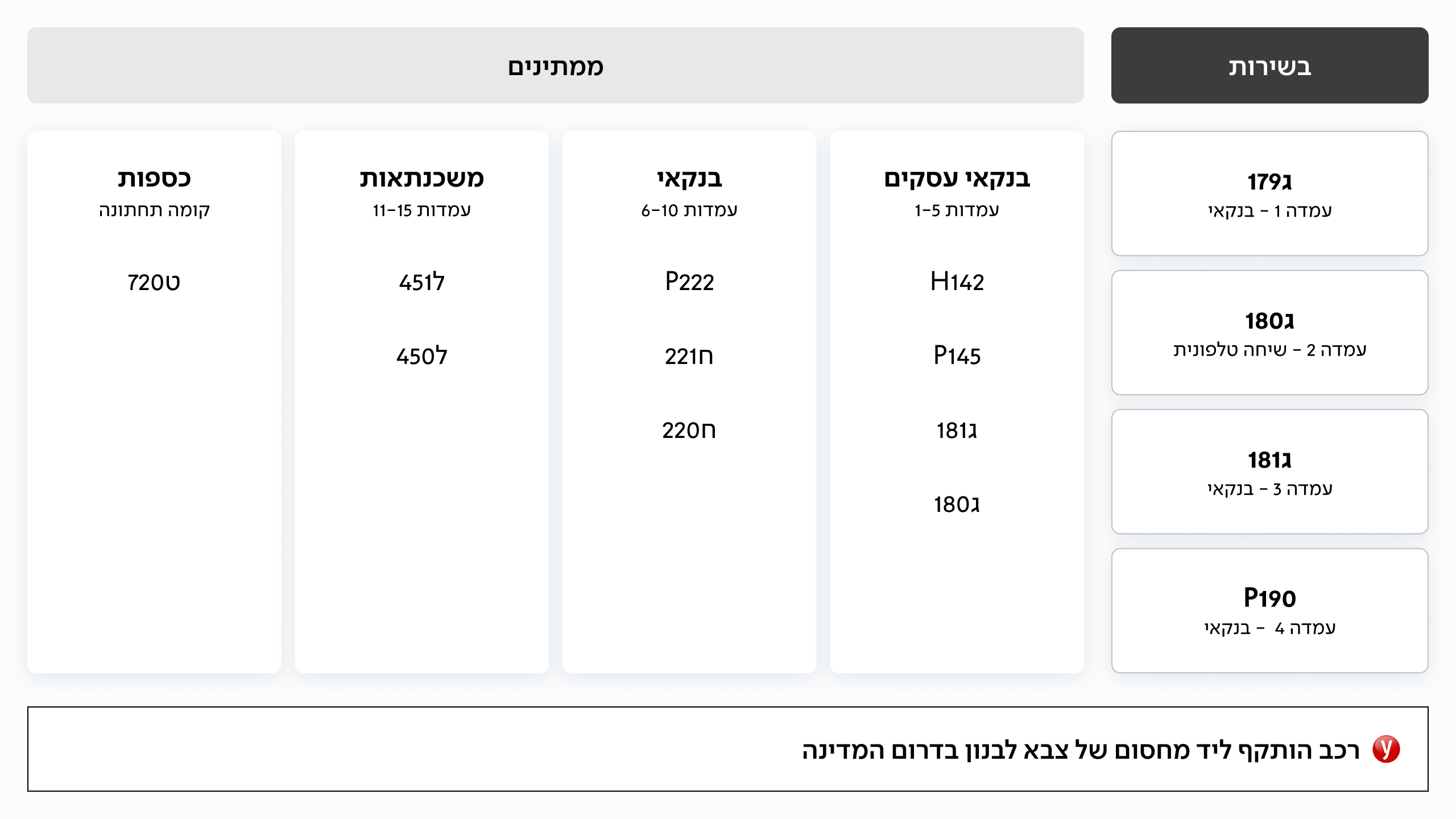
In the early stages, we created low-fidelity wireframes to quickly test and validate our assumptions. We focused on two key goals: ensuring that users understood the kiosk flow, and confirming that the plasma screen content was readable from a distance. To simulate real conditions, we screened the designs on actual TVs at the Leumi office and observed how users interacted with the content in a physical space.
Ideation TV Screen
Ideation TV Screen
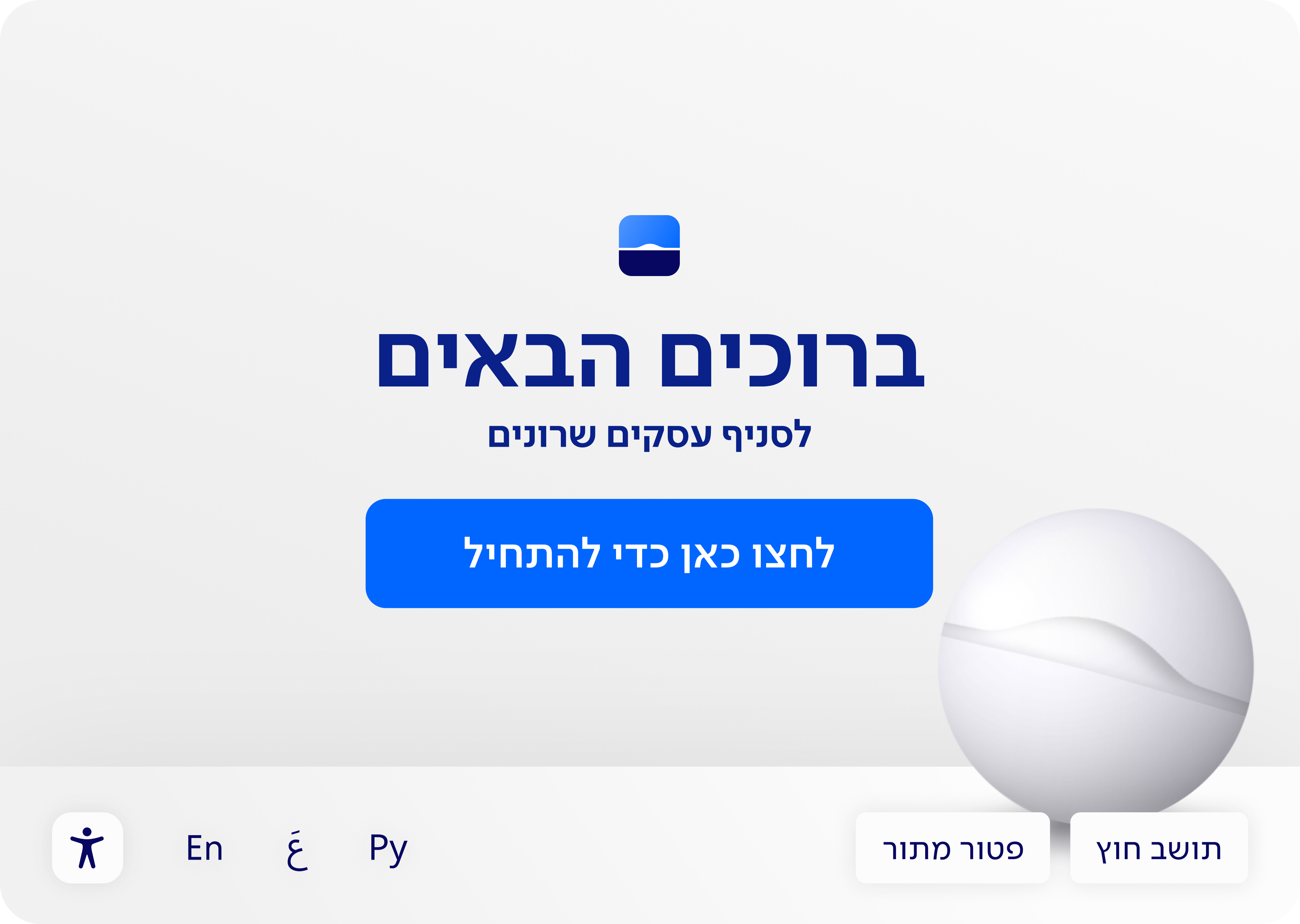
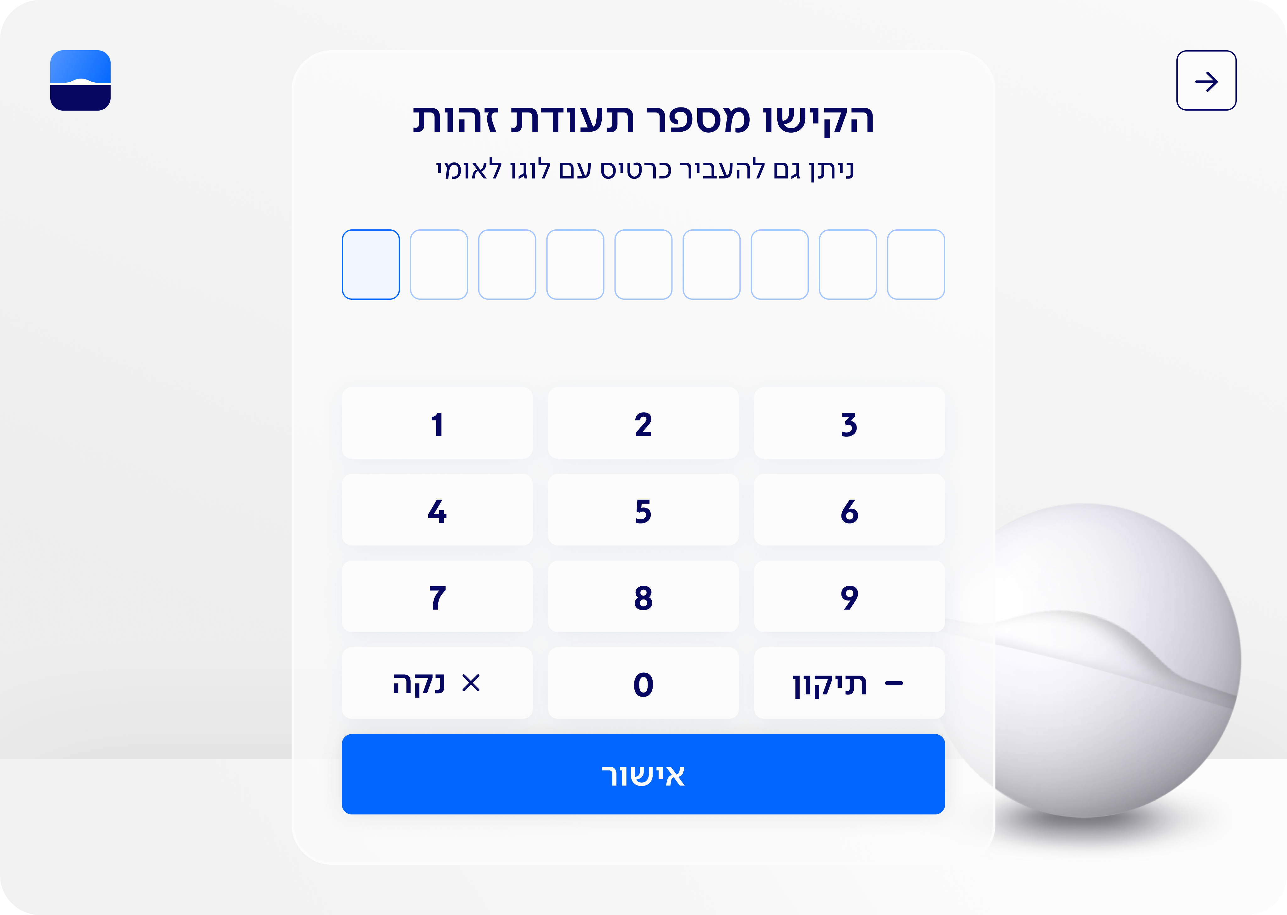
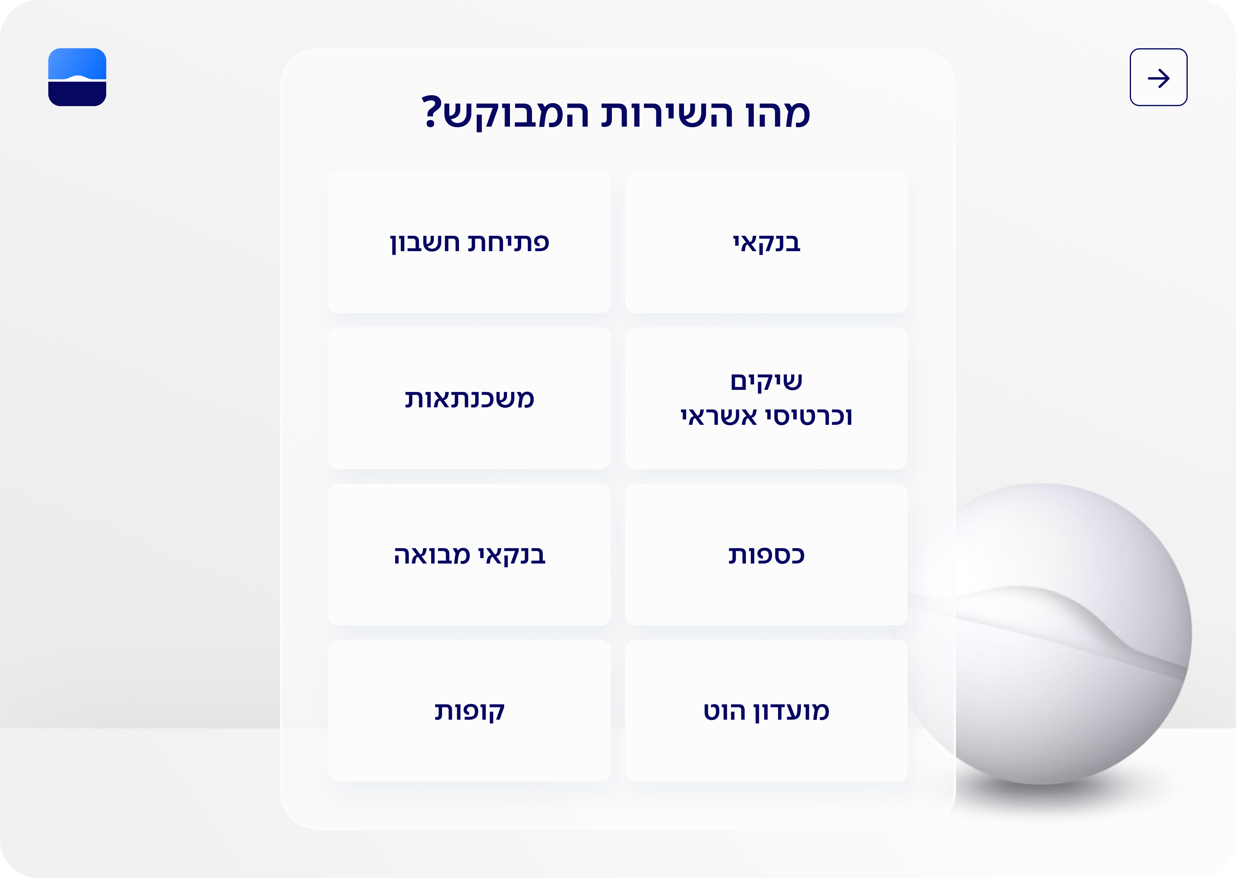
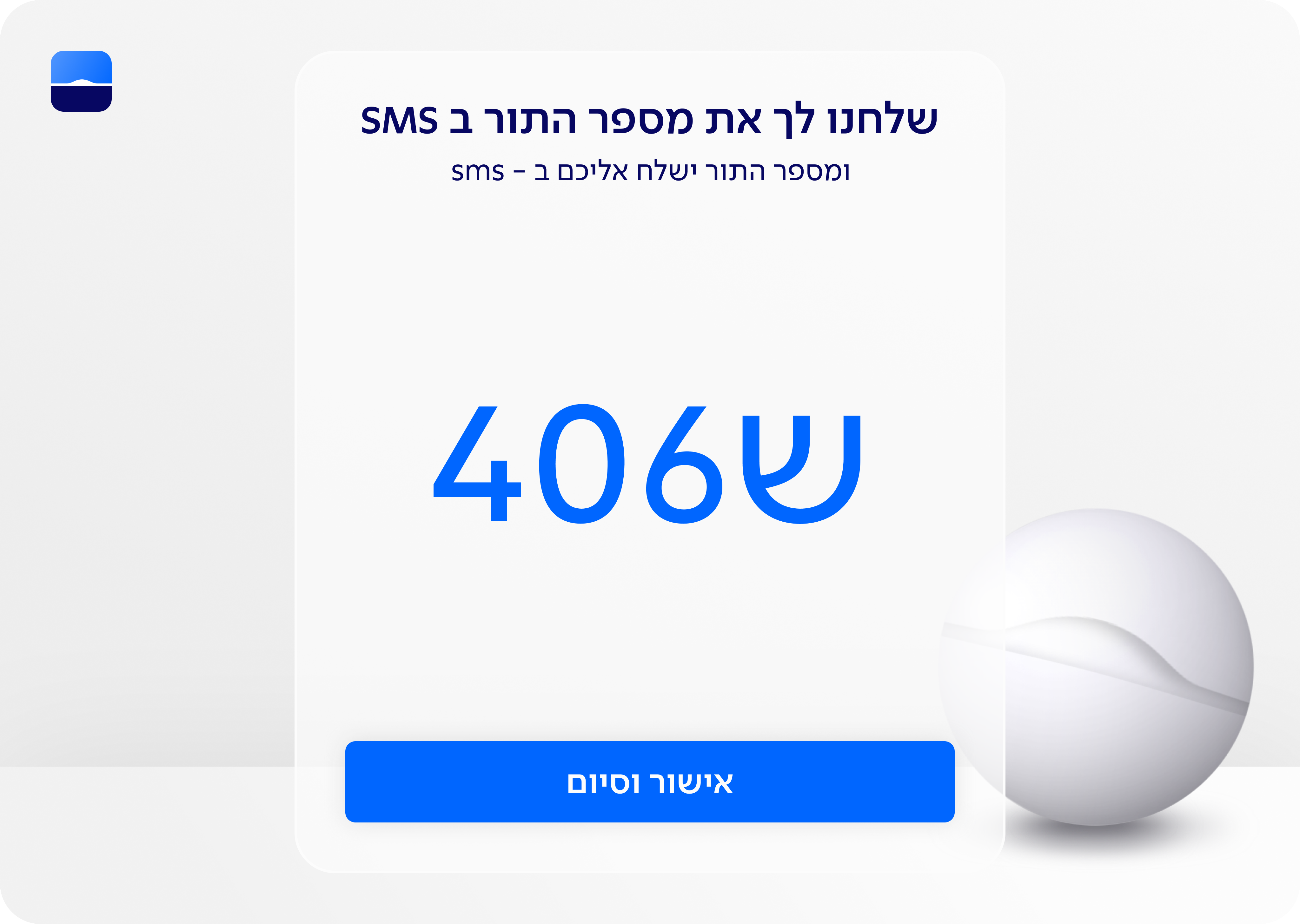
Final Design Kiosk Flow
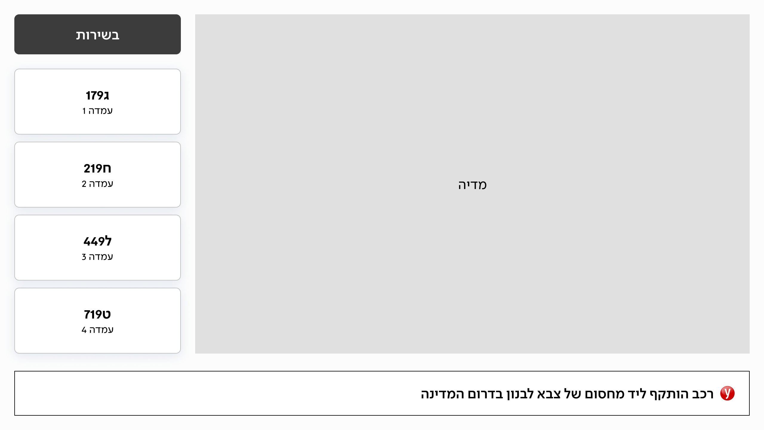
While I didn’t design the final UI myself, I was deeply involved in every design decision from layout structure to hierarchy, copy, and interaction details.
I worked closely with the UI designer to ensure that the final screens aligned with our research insights, user needs, and overall experience goals. The result is a clear, accessible, and intuitive interface that supports a smoother and more confident user journey.
Final Design TV
Results
More Projects
E-Commerce
b2c
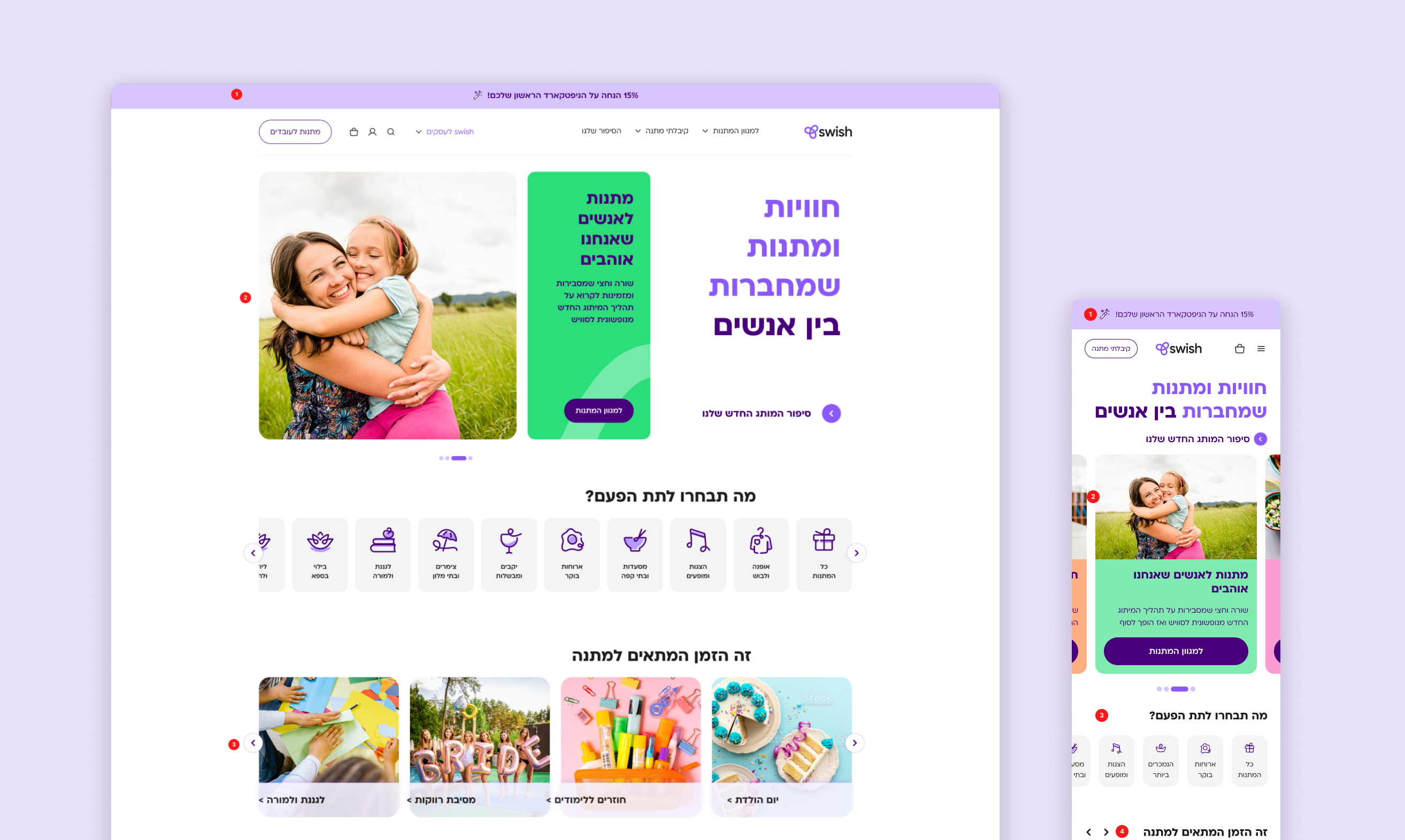
Re-designing Swish E-commerce Experience
How I drove UX consistency and managed product complexity for a 1M+ user banking app.
UX Designer
App&Web
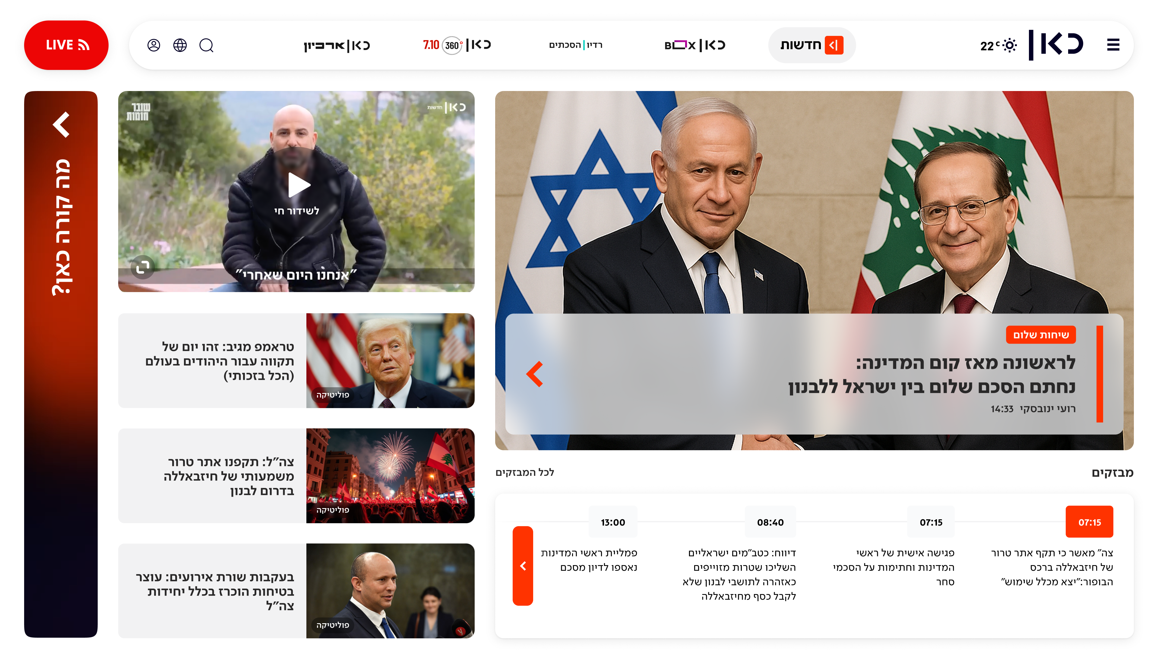
Redesigning Kan Homepage
From a News Hub to a Personalized Content.
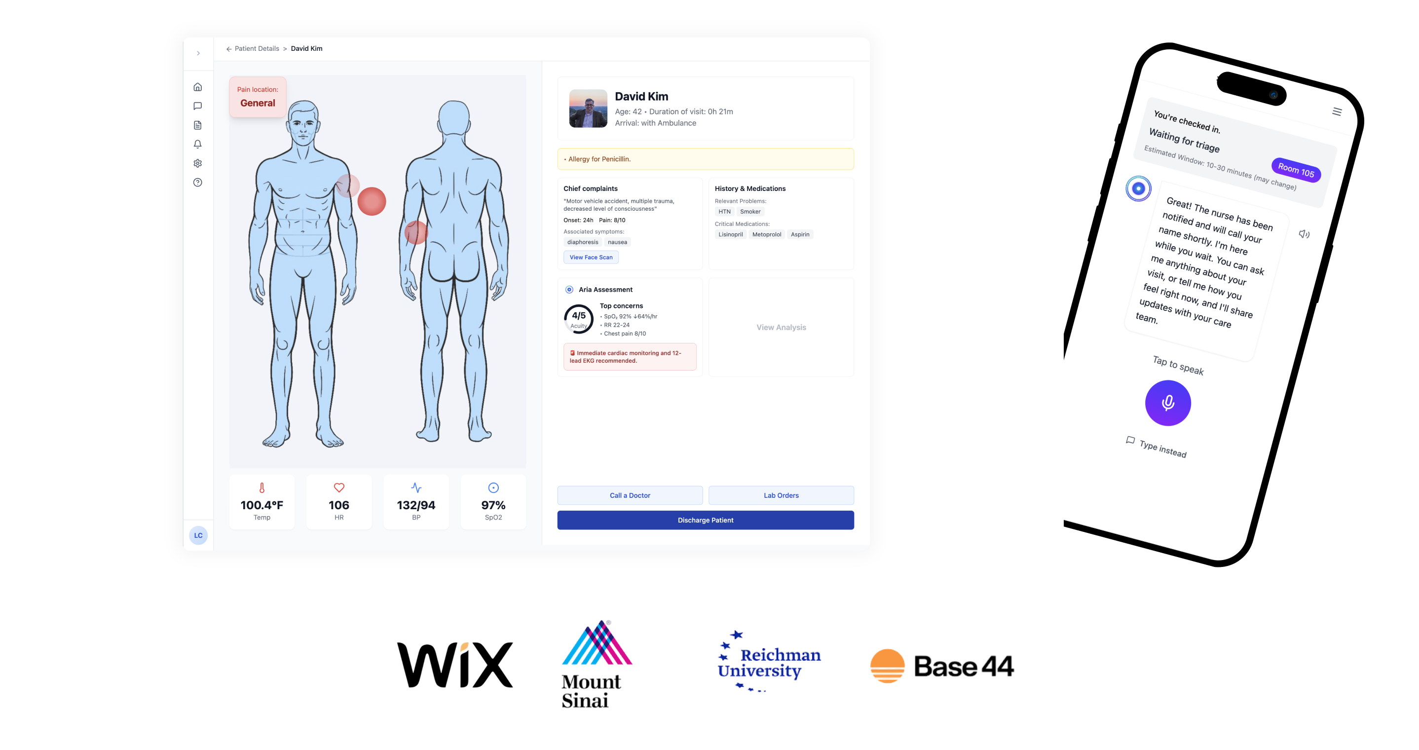
AI
Product Lead
Aria.AI: Empowering ER Nurses with Smart Triage
Award-winning AI agent reduces cognitive overload and helps emergency room nurses prioritize patients with confidence and speed.
Home
About
2024
Designing for Scale
at Bank Leumi
Bank Leumi
UX At Scale
Design System
My Role
Senior UX Designer
Company
Bank Leumi
Timeline
2024-2025

AI Summary
As a Senior UX Designer at Bank Leumi, I led the end-to-end design for key features within a complex, highly regulated financial ecosystem. My role involved navigating strict legal and compliance requirements while designing for millions of users. I managed the Information Architecture for the core mobile app, created detailed UX specifications for our design system, and led the design for an omnichannel experience by redesigning the in-branch physical kiosks to align with our new digital-first strategy.
The Challenge: Content Overload vs. User Attention
The primary challenge at Leumi was not just designing features, but doing so within one of Israel's most complex and secure product environments.
My goal was to untangle complex banking processes and present them as simple, accessible, and secure experiences for everyday users. This required balancing user needs against strict regulatory/legal constraints, legacy technical limitations, and the business's strategic goals.
My Process & Leadership
As a senior designer, my responsibilities went beyond wireframes. I owned the full UX process:
Discovery & Collaboration:
Working with PMs to define problem statements and KPIs.
In Charge of the App Information Architecture (IA):
I created and maintained the visual sitemap for the Leumi mobile app. This became a "single source of truth" that aligned all teams (product, dev, and management) on the app's structure and user flows.
End-to-End UX/UI:
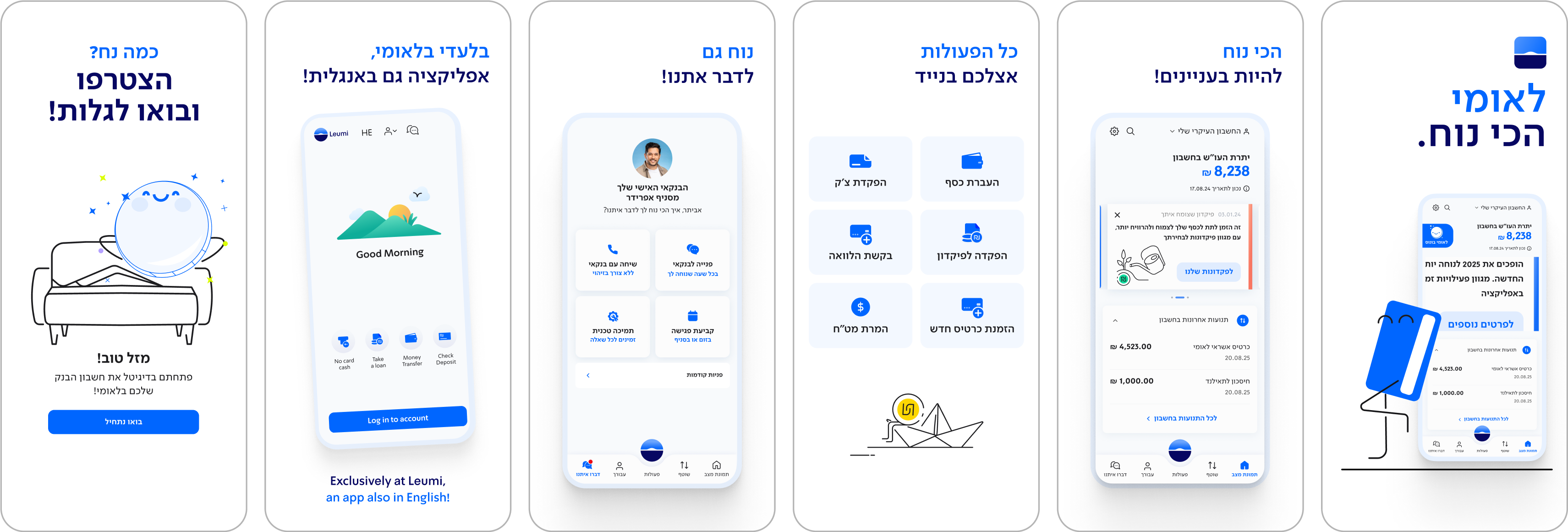
Designing user flows, wireframes, and high-fidelity prototypes.
Expanding the Design System
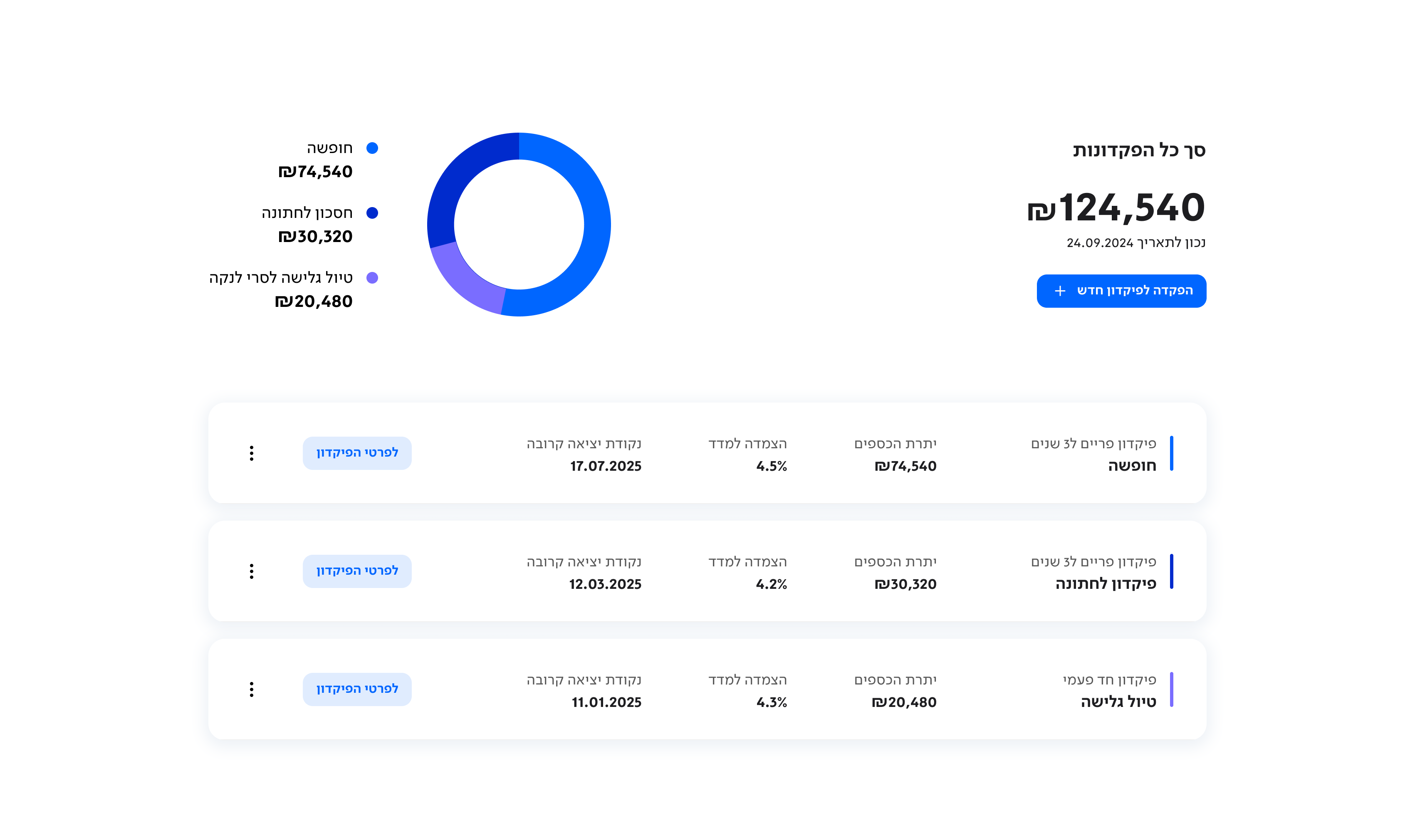
We created a new design system for Leumi, and i was in charge of all the UX Spec and handoff instructions.
UX Specifications & Handof
In each feature i designed i was accountable to deliver all the spec for the Developers
Create new design language for leumi website app
Additional Side Project: Kiosk & TV Redesign
Overview
As part of improving the in-branch experience at Bank Leumi, I redesigned the kiosk interface for taking a number and the accompanying TV screens that display queue status.
The Challange

How might we reduce confusion, anxiety, and frustration in a high-pressure physical environment.
Old Kiosk Screen
The interface was cluttered and unintuitive, making it difficult for users to choose the right service. Key actions were buried or unclear, leading to mistakes and slower queue times.
Old TV Screen
The display lacked clear visual hierarchy and didn’t communicate essential information such as wait times or station availability. Customers were left confused and uncertain about what to do next.
Design Process
Users Observations & Interviews
Through on-site observations, we saw that many customers hesitated at the kiosk, unsure which option to choose, and often needed assistance. At the waiting area, people frequently looked around in confusion, unsure if it was their turn or which station to approach. These behaviors highlighted a gap in clarity and guidance throughout the entire in-branch flow.
Competitive Research
As part of the research, I visited kiosks in banks and public spaces like McDonald’s, train stations, and government service centers. This helped me identify best practices in guiding users through time-sensitive flows, simplifying decision-making, and creating interfaces that reduce cognitive load. Insights from this benchmark research directly influenced the structure, clarity, and accessibility of our redesigned kiosk experience.
Research Insights Synthesis
New Kiosk Flow
Based on the research inisghts I created a streamlined user flow for the kiosk that significantly reduced the time it takes for customers to complete the number-taking process, but also has a clear start and finish.
User Testing
In the early stages, we created low-fidelity wireframes to quickly test and validate our assumptions. We focused on two key goals: ensuring that users understood the kiosk flow, and confirming that the plasma screen content was readable from a distance. To simulate real conditions, we screened the designs on actual TVs at the Leumi office and observed how users interacted with the content in a physical space.
Ideation TV Screen
Ideation TV Screen
Final Design Kiosk Flow
While I didn’t design the final UI myself, I was deeply involved in every design decision from layout structure to hierarchy, copy, and interaction details.
I worked closely with the UI designer to ensure that the final screens aligned with our research insights, user needs, and overall experience goals. The result is a clear, accessible, and intuitive interface that supports a smoother and more confident user journey.
Final Design TV
Results
More Projects
E-Commerce
b2c
Re-designing Swish E-commerce Experience
How I drove UX consistency and managed product complexity for a 1M+ user banking app.
UX Designer
App&Web
Redesigning Kan Homepage
From a News Hub to a Personalized Content.
AI
Product Lead
Aria.AI: Empowering ER Nurses with Smart Triage
Award-winning AI agent reduces cognitive overload and helps emergency room nurses prioritize patients with confidence and speed.